Chapter 11: Data visualization with Matplotlib
![]()
![]()
In the previous chapter we have created our first NumPy arrays (np.array(), np.arange()). We also learned and applied functions that can be used to analyze these arrays (e.g. np.mean(), np.std(), np.sum()…). Arrays are the common structure in which scientific data is handled in Python, MATLAB © and many other programming languages and analysis tools.
But what we still miss so far is a method to visualize data, i.e., arrays. Pure Python has no build-in visualization capabilities, but packages like Matplotlib overcome this problem.
Info: It is worth visiting the Matplotlib website ꜛ. The website has many good examples that cover many areas of application.
Basic plot commands
We start with an easy example and create two arrays x any y:
import numpy as np
import matplotlib.pyplot as plt # imports most relevant
                                # Matplotlib commands

"""if you're executing this script on Google Colab, please uncomment the next line:"""
# from google.colab import files

# create two NumPy arrays:
dx = 1     # step-size
length = 2 # length of the x-array

x = np.arange(0, length * np.pi, dx) # =length·π
y = np.sin(x) # our "signal"
We now plot the x-array against the y-array via shortest way with Matplotlib (with single-line command, should work in the most Python IDE):
plt.plot(x, y, '-.', label="Signal", lw=5)
plt.plot(x+1, y, '-', label="Signal 1", lw=1, c="lime")
plt.plot(x-1, y, '+', label="Signal 2", lw=5.75)
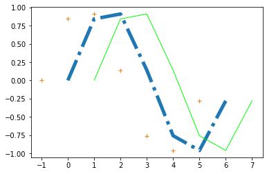
While the single-line command is handy and quick, we have options to get some more control over the plot layout and the plot figure:
fig = plt.figure(1) # gives us control over the plot window
fig.clf()           # clears any previous plot in the figure
plt.plot(x,y, label="Signal", lw=0.75)
plt.show()          # finalizes the plot
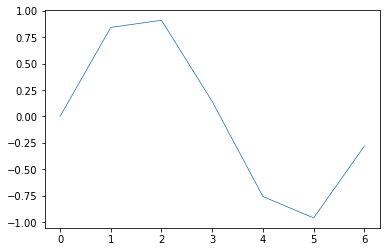
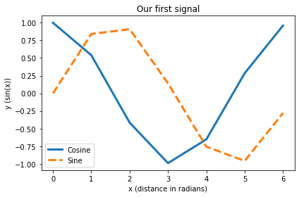
The output still looks the same, so let’s add some details such as axis labels, a title and a legend:
fig = plt.figure(76) # gives us control over the plot window
                    # e.g. open several different plot windows
                    # (just change the number in parentheses)
fig.clf()           # clears any previous plot in the figure

plt.plot(x,np.cos(x), label="Cosine", lw=3)
plt.plot(x,np.sin(x), "--", label="Sine", lw=3)

# axis labels and title:
plt.xlabel("x (distance in radians)")
plt.ylabel("y (sin(x))")
plt.title("Our first signal")

# shows a legend (best location determined by Matplotlib):
plt.legend(loc="best")

plt.tight_layout() # removes unnecessary white space on the figure
plt.show()          # finalizes the plot
As the plot is gone as soon as we close the figure window, we usually want to save our figure, e.g., as a PDF:
fig.savefig("my_plot.pdf", dpi=120)
"""if you're executing this script on Google Colab, please uncomment the next line:"""
# files.download("my_plot.pdf")
"""or, if you didn't use the fig = plt.figure(1) command (e.g. in Jupyter):"""
# plt.savefig("my_plot.pdf", dpi=120)
With the file extension specified in the file name, Matplotlib can automatically determine in which file format the plot should be saved (e.g. .pdf is saved as PDF, .png is saved as PNG, .jpg is saved as JPG).
Info: The statement "my_plot.pdf in the fig.savefig() command creates a PDF (with a resolution of 120 dpi) in the folder, in which your have saved (and executed) your Python script. It is also possible, to define any other path to save the PDF, e.g., My_Plots/my_plot.pdf or /Users/Henry/Python/my_plot.pdf.
Exercise 1
- Put the NumPy array definitions and the extended Matplotlib commands from above into a script.
- Run the script.
- Vary the step size
dxas well as the array lengthlengthand re-run the script (repeat this several times if you like to).
# Your solution 1 here (or create a pure Python script in Spyder):
Exercise 2
- Extend your script from Exercise 3 from the NumPy chapter by Matplotlib commands, so that it
- plots the
timearray vs. theyarray - plots the
timearray vs. they_noisyarray (just add anotherplt.plot()command) - plots the
timearray vs. they_denoised_3 - plots the
timearray vs. they_denoised_6
- plots the
- Add x- and y-labels and a title to your plot.
- Add a legend to your plot.
- Save your plot as a PDF and as a PNG (also here, just add another
fig.savefig()command). - Search on the web for the Matplotlib documentation of the
matplotlib.pyplot.legendcommand (note, that due to our importimport matplotlib.pyplot as plt, this is the full written command-name of ourplt.legend()). In this documentation, find the argument, that defines the location of the legend. Place the legend to the upper left corner. - Choose some colors ꜛ that suit your taste and change the color of the plots.
# Previous solution from Exercise 3 from the NumPy chapter:
import numpy as np
from scipy.ndimage import gaussian_filter1d
import matplotlib.pyplot as plt

# %% NUMPY: DEFINE SOME DATA WITH NOISE

# create data arrays:
time = np.arange(0,5, 0.1)
y = np.exp(time)

# add some noise:
y_noisy = y.copy()
y_noisy = y_noisy  + np.random.randn(len(time))*10

# apply filters:
y_denoised_3 = gaussian_filter1d(y_noisy, 3)
y_denoised_6 = gaussian_filter1d(y_noisy, 6)
# Your solution 2 here:
Toggle solution
# Solution:
# %% Plotting

fig=plt.figure(1)
fig.clf()

plt.plot(time, y, label ='raw signal', lw=5, color='y')
plt.plot(time, y_noisy, label = 'noisy signal')
plt.plot(time, y_denoised_3,
         label = 'filter with $\sigma$=3')
plt.plot(time, y_denoised_6,
         label = 'filter with $\sigma_y^5$=6', c='m')

plt.xlabel('time [s]')
plt.ylabel('signal')
plt.title('Signal vs. noisy signal vs. filtered signal')

#plt.legend(loc='best')
plt.legend(loc='upper left')

plt.tight_layout()
plt.show()

fig.savefig('my_signal_plot.pdf', dpi=120)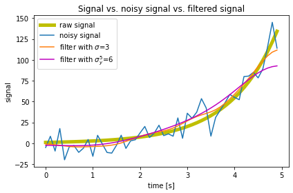
The statement $\sigma$ enables the LaTeX interpretation within the labeling command (works also in title and other text annotations).
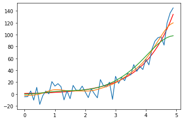
The above multi-line plot commands can also be packed into a single-line command (but with fewer adjustment possibilities):
# Single-line solution:
plt.plot(time, y, '-r',
         time, y_noisy,
         time, y_denoised_3,
         time, y_denoised_6)
Matplotlib commands can grow big very quickly. It’s often useful to plug these commands into a function definition, in order to keep your script readable and especially when you need to repeat your plot command(s) several times within your script.
The plot window “hack” in Spyder
Prior to Spyder 4.x, any plot was displayed in its own separate plot window. The advantage of these windows was, that they were interactive (to a certain degree), i.e., you could zoom in out without sacrificing resolution. Also, you could pick coordinates, which is sometimes helpful to explore your data.
If you want to get rid of the new but static internal plot window, change the following settings in Spyder:
Preferences > IPython console > Graphics > Graphics backend > Backend: Automatic
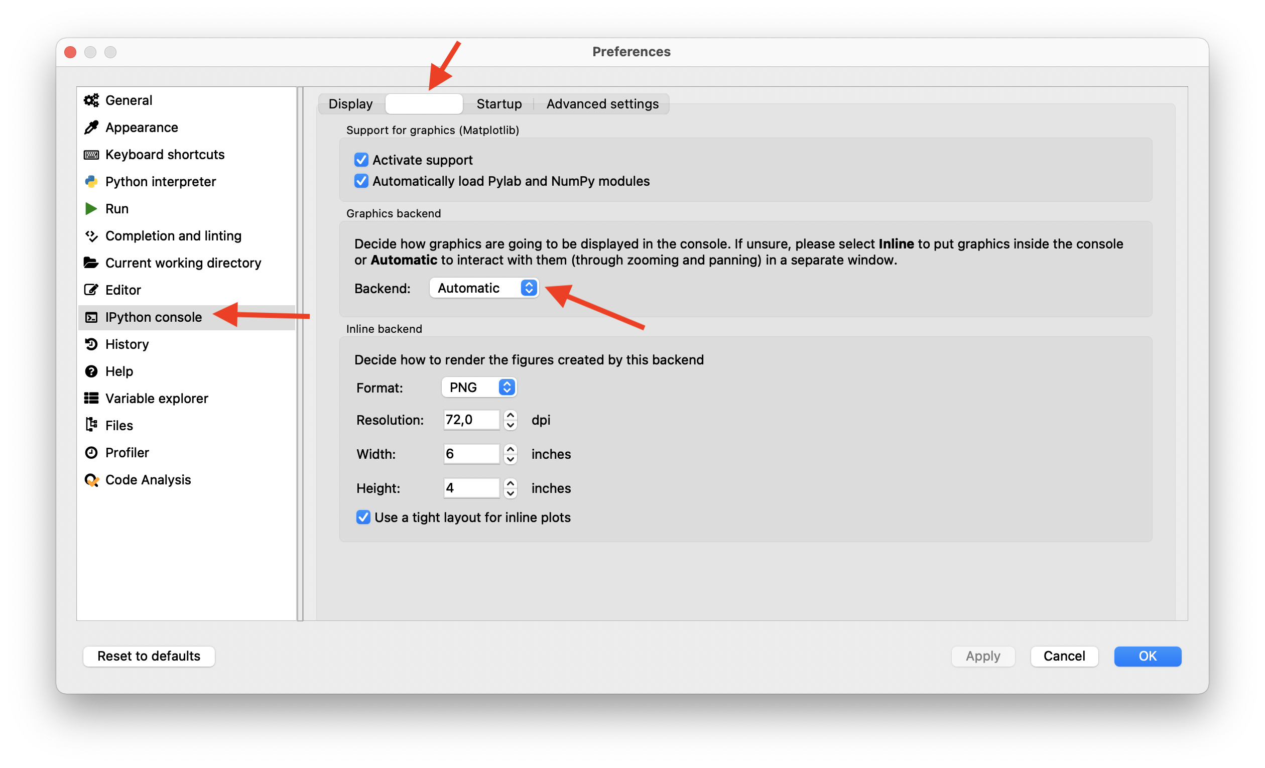
This enables an interactive, stand-alone plot/figure window for each plot you make.
Hint: In order to overcome having too many plot windows opened, e.g., emerging from a for-loop, you can address each plot window by the plt.figure(any_number) command.
The plot window “hack” in Jupyter
In case you want to have an interactive stand-alone plot window using a Jupyter notebook, type the following command once into a code cell of your notebook:
%matplotlib qt
After executing that cell, all your further plots will be opened in their own stand-alone window. If you want to turn back to inline plots within your notebook, comment the above command (or remove it) and re-run the cell once with the following command:
# %matplotlib qt
%matplotlib inline
Many thanks to Miguel ꜛ for this handy trick ![]() .
.
Alternative backends (instead of “qt”): ‘GTK3Agg’, ‘GTK3Cairo’, ‘MacOSX’, ‘nbAgg’, ‘Qt4Agg’, ‘Qt4Cairo’, ‘Qt5Agg’, ‘Qt5Cairo’, ‘TkAgg’, ‘TkCairo’, ‘WebAgg’, ‘WX’, ‘WXAgg’, ‘WXCairo’, ‘agg’, ‘cairo’, ‘pdf’, ‘pgf’, ‘ps’, ‘svg’, ‘template’.
Magic commands: The two commands shown above, that are initialized by the % sign, are so-called IPython Magic Commands. There even more of these very useful commands available, just check out this documentation website ꜛ.
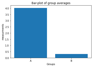
Exercise 3
- Create a new script and define the following NumPy arrays as dummy data arrays:
np.random.seed(1) Group_A = np.random.randn(10) * 10 + 5 Group_B = np.random.randn(10) * 10 + 2 - Plot the averages of
Group_AandGroup_Bin a bar-plot in figure 1:- use the plot command
plt.bar([1, 2], ["Mean of Group A", "Mean of Group B"]). Hint:"Mean of Group A"and"Mean of Group B"are just placeholders! Replace this with the according NumPy averaging command. - define the x-tick labels via
plt.xticks([1,2], labels=["A", "B"]) - add appropriate x- and y-labels and a title to your plot.
- save your plot as a PDF.
- use the plot command
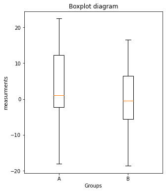
- Plot the values of
Group_AandGroup_B, respectively, in a boxplot in figure 2:- set the figure aspect ratio to 5x6 via
fig=plt.figure(2, figsize=(5,6)) - use the plot command
plt.boxplot([Group_A, Group_B]) - define the x-tick labels via
plt.xticks([1,2], labels=["A", "B"]) - add appropriate x- and y-labels and a title to your plot.
- save your plot as a PDF.
- set the figure aspect ratio to 5x6 via
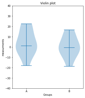
- Same as 3., but now use the command
plt.violinplot([Group_A, Group_B], showmedians=True)to plot the values in figure 3.
# Your solution 3.1 here:
Toggle solution
# Solution 3.1
import numpy as np
import matplotlib.pyplot as plt

# Generate some random dummy data:
np.random.seed(1)
Group_A = np.random.randn(10)*10+5
Group_B = np.random.randn(10)*10+2
# Your solution 3.2 here:
Toggle solution
# Solution 3.2
fig=plt.figure(1)
fig.clf()

plt.bar([1, 2], [Group_A.mean(), Group_B.mean()])

plt.xticks([1, 2], labels=["A", "B"])
plt.xlabel("Groups")
plt.ylabel("measurements")
plt.title("Bar-plot of group averages")

plt.tight_layout
plt.show()
fig.savefig("barplot.pdf", dpi=120)
# Your solution 3.3 here:
Toggle solution
# Solution 3.3
fig=plt.figure(2, figsize=(5,6))
fig.clf()

x_ticks_A = np.ones(len(Group_A))
x_ticks_B = np.ones(len(Group_B))

plt.boxplot([Group_A, Group_B])

plt.xticks([1,2], labels=["A", "B"])
plt.xlabel("Groups")
plt.ylabel("measurements")
plt.title("Boxplot diagram")
plt.tight_layout
plt.show()
fig.savefig("boxplot.pdf", dpi=120)
# Your solution 3.4 here:
Toggle solution
# Solution 3.4
fig=plt.figure(3, figsize=(5,6))
fig.clf()

plt.violinplot([Group_A, Group_B], showmedians=True)
#plt.boxplot([Group_A, Group_B])

plt.xticks([1,2], labels=["A", "B"])
plt.xlabel("Groups")
plt.ylabel("measurements")
plt.title("Violin plot")
plt.tight_layout
plt.ylim(-40, 40)
plt.show()
fig.savefig("violinplot.pdf", dpi=120)
Further readings
In this course, we can not go too far into depth of the topics of each chapter. This is also the case in this chapter. The power and functions of Matplotlib are vast, we only touched a few aspects of them. If you want to explore its full potential, as already stated at the beginning of this chapter, visit the Matplotlib website, which contains many good examples and an excellent documentation. For example, explore more
-
linestyles, markerstyles and colors ꜛ. This documentation page also contains a list of additional
pypplot(plt.plot()) arguments like-
alpha(adjusting opacity of the plotted line) -
color,c(define the color of a plotted line) -
label(gives your line a name, that theplt.legend()then uses to show it in a legend) -
linestyle,ls(defines the linestyle) -
linewdth,lw(defines the linewidth) -
marker(defines the marker style) -
markeredgecolor,mecandmarkerfacecolor,mfc(defines the color of the chosen marker) -
markersize,ms(defines the size of the chosen marker)
-
- about adjusting the legend ꜛ
- and colors ꜛ
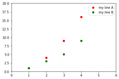
# Example:
import matplotlib.pyplot as plt

plt.plot([1,2,3,4], [1,4,9,16], 'ro', label="my line A")
plt.plot([1,2,3,4], [1,3,5,9], 'go', label="my line B")
plt.axis([0, 6, 0, 20])
plt.legend()
plt.show()