Improving matplotlib plots
![]()
![]()
In this tutorial we will learn, how to make default matplotlib plots look more appealing with just a few extra commands.
Let’s create some dummy data:
import numpy as np
import matplotlib.pyplot as plt
import pingouin as pg

# Generate some random dummy data:
np.random.seed(1)
Group_A = np.random.randn(10)*10+15
Group_B = np.random.randn(10)*10+2

# bar-plot:
fig=plt.figure(1, figsize=(4,6))
fig.clf()

plt.bar([1, 2], [Group_A.mean(), Group_B.mean()],
        color=["blue", "orange"])

plt.xticks([1,2], labels=["A", "B"])
plt.xlabel("Groups")
plt.ylabel("measurements")
plt.title("A bar-plot")

plt.xlim([0.5, 2.5])

plt.tight_layout
plt.show()
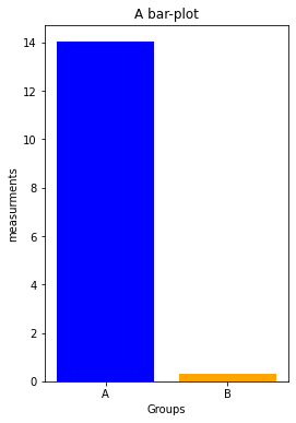
First, we change the bar-plot to a dot-plot, which provides a better visual impression of the data distributions. We will also adjust the fontsizes:
fig=plt.figure(1, figsize=(4,6))
fig.clf()

xVals = np.ones(Group_A.shape[0])

# Group A data:
plt.plot(xVals, Group_A, 'o', markeredgecolor="blue",
         markerfacecolor="blue", markersize=20, alpha=0.5)
plt.plot(1, Group_A.mean(), 'o', markeredgecolor="k",
         markerfacecolor="white", markersize=20)

# Group B data:
plt.plot(xVals+1, Group_B, 'o', markeredgecolor="orange",
         markerfacecolor="orange", markersize=20, alpha=0.5)
plt.plot(2, Group_B.mean(), 'o', markeredgecolor="k",
         markerfacecolor="white", markersize=20)

plt.xticks([1,2], labels=["A", "B"], fontsize=16)
plt.xlabel("Groups", fontsize=16)
plt.ylabel("measurements", fontsize=16)
plt.title("A dot-plot", fontsize=22, fontweight="normal")

plt.xlim([0.5, 2.5])

plt.tight_layout
plt.show()
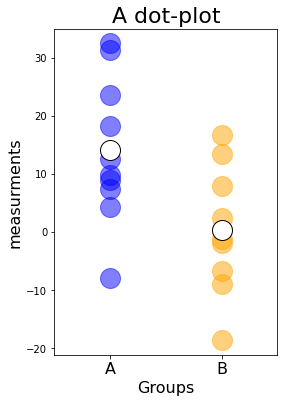
We also increased the discernibility of the individual data points via the alpha value, which controls the transparency. The transparency also had an effect on the plot colors, which became a bit muted and look less like matplotlib’s default color definitions.
Next, let’s
- remove parts of the black bounding box
ax.spines["top/right"].set_visible(False)
- change the thickness of the remaining bounds
ax.spines["bottom/left"].set_linewidth(2)
- increase the size of the ticks
ax.tick_params(width=2, length=10)
fig=plt.figure(1, figsize=(4,6))
fig.clf()

# Group A data:
plt.plot(xVals, Group_A, 'o', markeredgecolor="blue",
         markerfacecolor="blue", markersize=20, alpha=0.5)
plt.plot(1, Group_A.mean(), 'o', markeredgecolor="k",
         markerfacecolor="white", markersize=20)

# Group B data:
plt.plot(xVals+1, Group_B, 'o', markeredgecolor="orange",
         markerfacecolor="orange", markersize=20, alpha=0.5)
plt.plot(2, Group_B.mean(), 'o', markeredgecolor="k",
         markerfacecolor="white", markersize=20)

plt.xticks([1,2], labels=["A", "B"], fontsize=16)
plt.yticks(fontsize=16)
plt.xlabel("Groups", fontsize=16)
plt.ylabel("measurements", fontsize=16)
plt.title("A dot-plot", fontsize=22, fontweight="normal")

# control the black bound box and tick sizes:
ax = plt.gca() # get current axis
ax.spines["right"].set_visible(False)
ax.spines["top"].set_visible(False)
ax.spines["bottom"].set_linewidth(2)
ax.spines["left"].set_linewidth(2)
ax.tick_params(width=2, length=10)

plt.xlim([0.5, 2.5])

plt.tight_layout
plt.show()
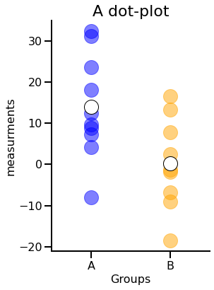
While changing the transparency works best when you want to visualize multiple datapoints (e.g., in dot- and scatter-plots, multiple line plots), removing parts of the black bounding box and increasing the fontsizes work well for almost any matplotlib plot.
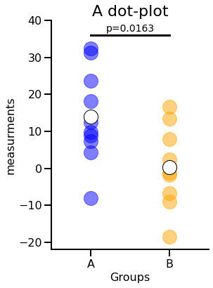
Add statistical annotations to your plot
Let’s perform a simple statistical test:
# let's check the statistics:
stats_results = pg.ttest(Group_A, Group_B, paired=False)
p_val = stats_results["p-val"].values[0].round(4)
print(f"p-value: {p_val}")
p-value: 0.0163
We now annotate our plot with the result from the statistical test:
fig=plt.figure(1, figsize=(4,6))
fig.clf()

# Group A data:
plt.plot(xVals, Group_A, 'o', markeredgecolor="blue",
         markerfacecolor="blue", markersize=20, alpha=0.5)
plt.plot(1, Group_A.mean(), 'o', markeredgecolor="k",
         markerfacecolor="white", markersize=20)

# Group B data:
plt.plot(xVals+1, Group_B, 'o', markeredgecolor="orange",
         markerfacecolor="orange", markersize=20, alpha=0.5)
plt.plot(2, Group_B.mean(), 'o', markeredgecolor="k",
         markerfacecolor="white", markersize=20)

# statistical annotations:
h = 36 # height of the horizontal bar
annotation_offset = 0.5 # offset of the stats-annotation
plt.plot([1, 2], [h, h], '-k', lw=3)
plt.text(1.5, h+annotation_offset,
         "p="+str(p_val),
         ha='center', va='bottom', fontsize=14)

plt.xticks([1,2], labels=["A", "B"], fontsize=16)
plt.yticks(fontsize=16)
plt.xlabel("Groups", fontsize=16)
plt.ylabel("measurements", fontsize=16)
plt.title("A dot-plot", fontsize=22, fontweight="normal")

# control the black bound box and tick sizes:
ax = plt.gca() # get current axis
ax.spines["right"].set_visible(False)
ax.spines["top"].set_visible(False)
ax.spines["bottom"].set_linewidth(2)
ax.spines["left"].set_linewidth(2)
ax.tick_params(width=2, length=10)

plt.xlim([0.5, 2.5])
plt.ylim([-22, 40])

plt.tight_layout
plt.show()
Exercise 1
- Implement an if-statement to check for normality and let your script choose the correct significance test (Student’s t-test or Mann-Whitney-U). Hint: Pingoiun has a normality-check function as well as the corresponding test-functions.
-
Complete the decision tree for the stars-annotation. You can use the notation convention from GraphPad:
Symbol Meaning n.s. $p\gt$0.05 $\mbox{*}$ $p\le0.05$ $\mbox{**}$ $p\le0.01$ $\mbox{***}$ $p\le0.001$ $\mbox{****}$ $p\le0.0001$ - Replace the p-value by the stars-annotation in the plot.
- Display the p-value below the stars-annotation.
# Your solution 1 here:
significance tets applied: ttest p-value: 0.0163

Toggle solution
normtest_A = pg.normality(Group_A)
normtest_B = pg.normality(Group_B)

if (normtest_A['normal'].values) and (normtest_B['normal'].values):
    stats_results = pg.ttest(Group_A, Group_B, paired=False)
    test_type="ttest"
else:
    stats_results = pg.mwu(Group_A, Group_B, alternative='two-sided')
    test_type="mwu"
p_val = stats_results["p-val"].values[0].round(4)
print(f"significance tets applied: {test_type}")
print(f"p-value: {p_val}")

def asteriskscheck(pval):
    if stats_results["p-val"].values<=0.0001:
        asterisks="****"
    elif stats_results["p-val"].values<=0.001:
        asterisks="***"
    elif stats_results["p-val"].values<=0.01:
        asterisks="**"
    elif stats_results["p-val"].values<=0.05:
        asterisks="*"
    else:
        asterisks="n.s."
    return asterisks

fig=plt.figure(1, figsize=(4,6))
fig.clf()

# Group A data:
plt.plot(xVals, Group_A, 'o', markeredgecolor="blue",
         markerfacecolor="blue", markersize=20,
         alpha=0.5)
plt.plot(1, Group_A.mean(), 'o', markeredgecolor="k",
         markerfacecolor="white", markersize=20)

# Group B data:
plt.plot(xVals+1, Group_B, 'o', markeredgecolor="orange",
         markerfacecolor="orange", markersize=20,
         alpha=0.5)
plt.plot(2, Group_B.mean(), 'o', markeredgecolor="k",
         markerfacecolor="white", markersize=20)

# statistical annotations:
h = 36 # height of the horizontal bar
annotation_offset = 0.5 # offset of the stats-annotation
plt.plot([1, 2], [h, h], '-k', lw=3)
plt.text(1.5, h+annotation_offset,
         asteriskscheck(p_val),
         ha='center', va='bottom', fontsize=16)
plt.text(1.5, h-annotation_offset,
         "p="+str(p_val),
         ha='center', va='top', fontsize=14)

plt.xticks([1,2], labels=["A", "B"], fontsize=16)
plt.yticks(fontsize=16)
plt.xlabel("Groups", fontsize=16)
plt.ylabel("measurements", fontsize=16)
plt.title("A dot-plot", fontsize=22, fontweight="normal")

# control the black bound box and tick sizes:
ax = plt.gca() # get current axis
ax.spines["right"].set_visible(False)
ax.spines["top"].set_visible(False)
ax.spines["bottom"].set_linewidth(2)
ax.spines["left"].set_linewidth(2)
ax.tick_params(width=2, length=10)

plt.xlim([0.5, 2.5])
plt.ylim([-22, 40])

plt.tight_layout
plt.show()Further readings
You can find a bunch of other visualization hacks in the free online book Fundamentals of Data Visualization: A Primer on Making Informative and Compelling Figures by Calus O. Wilkeꜛ (O’Reilly, 2019)