How to add statistical annotations to matplotlib plots
It’s actually no big deal to add some statistical annotations to matplotlib plots. Let’s recap the example from the previous post,
import numpy as np
import matplotlib.pyplot as plt

# Generate some random dummy data:
np.random.seed(1)
Group_A = np.random.randn(10)*10+15
Group_B = np.random.randn(10)*10+2

fig=plt.figure(1, figsize=(4,6))
fig.clf()

# Group A data:
plt.plot(xVals, Group_A, 'o', markeredgecolor="blue",
         markerfacecolor="blue", markersize=20, alpha=0.5)
plt.plot(1, Group_A.mean(), 'o', markeredgecolor="k",
         markerfacecolor="white", markersize=20)

# Group B data:
plt.plot(xVals+1, Group_B, 'o', markeredgecolor="orange",
         markerfacecolor="orange", markersize=20, alpha=0.5)
plt.plot(2, Group_B.mean(), 'o', markeredgecolor="k",
         markerfacecolor="white", markersize=20)

plt.xticks([1,2], labels=["A", "B"], fontsize=16)
plt.yticks(fontsize=16)
plt.xlabel("Groups", fontsize=16)
plt.ylabel("measurements", fontsize=16)
plt.title("A dot-plot", fontsize=22, fontweight="normal")

# control the black bound box and tick sizes:
ax = plt.gca() # get current axis
ax.spines["right"].set_visible(False)
ax.spines["top"].set_visible(False)
ax.spines["bottom"].set_linewidth(2)
ax.spines["left"].set_linewidth(2)
ax.tick_params(width=2, length=10)

plt.xlim([0.5, 2.5])

plt.tight_layout
plt.show()
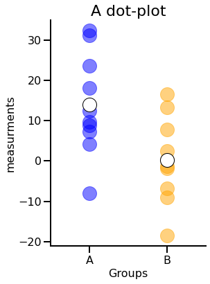
and perform a simple statistical test:
stats_results = pg.ttest(Group_A, Group_B, paired=False)
p_val = stats_results["p-val"].values[0].round(4)
print(f"p-value: {p_val}")
p-value: 0.0163
We can annotate our plot just by adding a horizontal line between the two data sets and add test result:
def asteriskscheck(pval):
    if stats_results["p-val"].values<=0.0001:
        asterisks="****"
    elif stats_results["p-val"].values<=0.001:
        asterisks="***"
    elif stats_results["p-val"].values<=0.01:
        asterisks="**"
    elif stats_results["p-val"].values<=0.05:
        asterisks="*"
    else:
        asterisks="n.s."
    return asterisks

fig=plt.figure(1, figsize=(4,6))
fig.clf()

# Group A data:
plt.plot(xVals, Group_A, 'o', markeredgecolor="blue",
         markerfacecolor="blue", markersize=20, alpha=0.5)
plt.plot(1, Group_A.mean(), 'o', markeredgecolor="k",
         markerfacecolor="white", markersize=20)

# Group B data:
plt.plot(xVals+1, Group_B, 'o', markeredgecolor="orange",
         markerfacecolor="orange", markersize=20, alpha=0.5)
plt.plot(2, Group_B.mean(), 'o', markeredgecolor="k",
         markerfacecolor="white", markersize=20)

# statistical annotations:
h = 36 # height of the horizontal bar
annotation_offset = 0.5 # offset of the stats-annotation
plt.plot([1, 2], [h, h], '-k', lw=3)
plt.text(1.5, h+annotation_offset,
         asteriskscheck(p_val),
         ha='center', va='bottom', fontsize=16)

plt.xticks([1,2], labels=["A", "B"], fontsize=16)
plt.yticks(fontsize=16)
plt.xlabel("Groups", fontsize=16)
plt.ylabel("measurements", fontsize=16)
plt.title("A dot-plot", fontsize=22, fontweight="normal")

# control the black bound box and tick sizes:
ax = plt.gca() # get current axis
ax.spines["right"].set_visible(False)
ax.spines["top"].set_visible(False)
ax.spines["bottom"].set_linewidth(2)
ax.spines["left"].set_linewidth(2)
ax.tick_params(width=2, length=10)

plt.xlim([0.5, 2.5])
plt.ylim([-22, 40])

plt.tight_layout
plt.show()
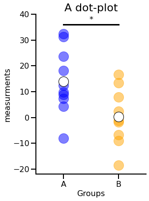
That’s everything! Of course, for problems with more than two samples the commands become a bit more complex. But the principle is always the same.
Asterisks conventions
The function asteriskscheck(pval) follows the asterisks conventions from GraphPadꜛ:
| Symbol | Meaning |
|---|---|
| n.s. | $p\gt0.05$ |
| $\mbox{*}$ | $p\le0.05$ |
| $\mbox{**}$ | $p\le0.01$ |
| $\mbox{***}$ | $p\le0.001$ |
| $\mbox{****}$ | $p\le0.0001$ |


comments