Chapter 12: Reading data with Pandas
![]()
![]()
The so-called Pandas DataFrame is kind of a representation of tables in Python, which has – similar to a 2D NumPy array – rows and columns, that can be directly accessed via their column names, called key (similar to the keys of dictionaries), instead of using an index value (which is also possible). The Pandas DataFrame comes with the Pandas package: pandas.pydata.org/docs ꜛ.

The scope of what we can do with Pandas is huge. Originally from the financial world, Pandas offers powerful spreadsheet tools (labeled columns and rows, descriptive statistics, pivoting, filtering and grouping, built-in plot functions - just to name a few). We can not go into detail here, but we will make use of Pandas’ very handy Excel file import function pd.read_excel(path_to_file, index_col=0):
import pandas as pd
import os

import numpy as np
import matplotlib.pyplot as plt

# Define file paths:
file_path = "Data/Pandas_1/"

""" file_path is the main root path. Adjust this to
    the absolute path to your Data/Pandas_1/ folder
    or put all Excel files into your script's folder
    and set file_path = ""
"""

file_name_1 = "Group_A_data.xls"
file_name_2 = "Group_B_data.xls"

file_1 = os.path.join(file_path, file_name_1)
file_2 = os.path.join(file_path, file_name_2)

""" The os.path.join() command just sticks the different
    file-path components together. You can also just write
    file_1 = file_path + file_name_1
    file_2 = file_path + file_name_2
"""

# Read the Excel files with Pandas into a Pandas Dataframe:
Group_A_df = pd.read_excel(file_1, index_col=0)
Group_B_df = pd.read_excel(file_2, index_col=0)
The two Excel files are imported as DataFrames into Group_A_df and Group_B_df, respectively. Next, we extract the DataFrame data into two NumPy arrays:
# Extracting the DataFrame import data:
Group_A = Group_A_df["Data"].values
Group_B = Group_B_df["Data"].values
We can apply any operation to the two NumPy arrays Group_A and Group_B, that we have previously learned in the NumPy chapter. By redefining our previous plot script from the Matplotlib chapter (Exercise 2 there), we are able to re-run the entire script, now applied to the imported Excel data:
Exercise 1
- Copy your solution from Exercise 3 from the Matplotlib chapter into a new script.
- Add the Pandas Excel file import commands from above to your script.
- Uncomment or redefine your
Group_AandGroup_Bvariable definitions according to:Group_A = Group_A_df["Data"].values Group_B = Group_B_df["Data"].values - Run your new script.
- Now, instead of reading the file “Group_B_data.xls”, read “Group_B2_data.xls” as Group B data and re-run your script
# Your solution 1 here:
Toggle solution
# Solution 1:
import pandas as pd
import os
import numpy as np
import matplotlib.pyplot as plt
import pingouin as pg
# Define file paths:
file_path = "Data/Pandas_1/"
file_name_1 = "Group_A_data.xls"
file_name_2 = "Group_B2_data.xls"
file_1 = os.path.join(file_path, file_name_1)
file_2 = os.path.join(file_path, file_name_2)
# Read the Excel files with Pandas into a Pandas Dataframe:
Group_A_df = pd.read_excel(file_1, index_col=0)
Group_B_df = pd.read_excel(file_2, index_col=0)
# Broadcast the DataFrame data into the appropriate variables:
     Group_A = Group_A_df["Data"].values
     Group_B = Group_B_df["Data"].values
""" The following code is simply your copied solution from the
Matplotlib Exercise:
"""
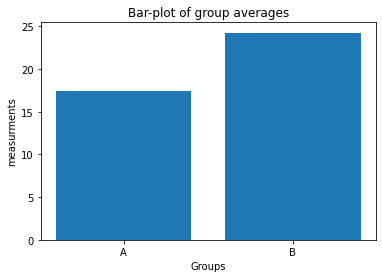
# BAR-PLOT
fig=plt.figure(1)
fig.clf()
plt.bar([1, 2], [Group_A.mean(), Group_B.mean()])
plt.xticks([1,2], labels=["A", "B"])
plt.xlabel("Groups")
plt.ylabel("measurements")
plt.title("Bar-plot of group averages")
plt.tight_layout()
plt.show()
fig.savefig("barplot with data.pdf", dpi=120)
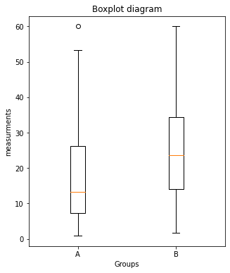
# BOX-PLOTS:
fig=plt.figure(2, figsize=(5,6))
fig.clf()
plt.boxplot([Group_A, Group_B])
plt.xticks([1,2], labels=["A", "B"])
plt.xlabel("Groups")
plt.ylabel("measurements")
plt.title("Boxplot diagram")
plt.tight_layout
plt.show()
fig.savefig("boxplot with data.pdf", dpi=120)
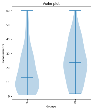
# VIOLIN-PLOTS:
fig=plt.figure(3, figsize=(5,6))
fig.clf()
plt.violinplot([Group_A, Group_B], showmedians=True)
plt.xticks([1,2], labels=["A", "B"])
plt.xlabel("Groups")
plt.ylabel("measurements")
plt.title("Violin plot")
plt.tight_layout
# plt.ylim(-40, 40)
plt.show()
fig.savefig("violinplot with data.pdf", dpi=120)