Chapter 13: Statistical Analysis with Pingouin
![]()
![]()
Pingouin ꜛ is a compact package that provides the most important test tools for a significance study.

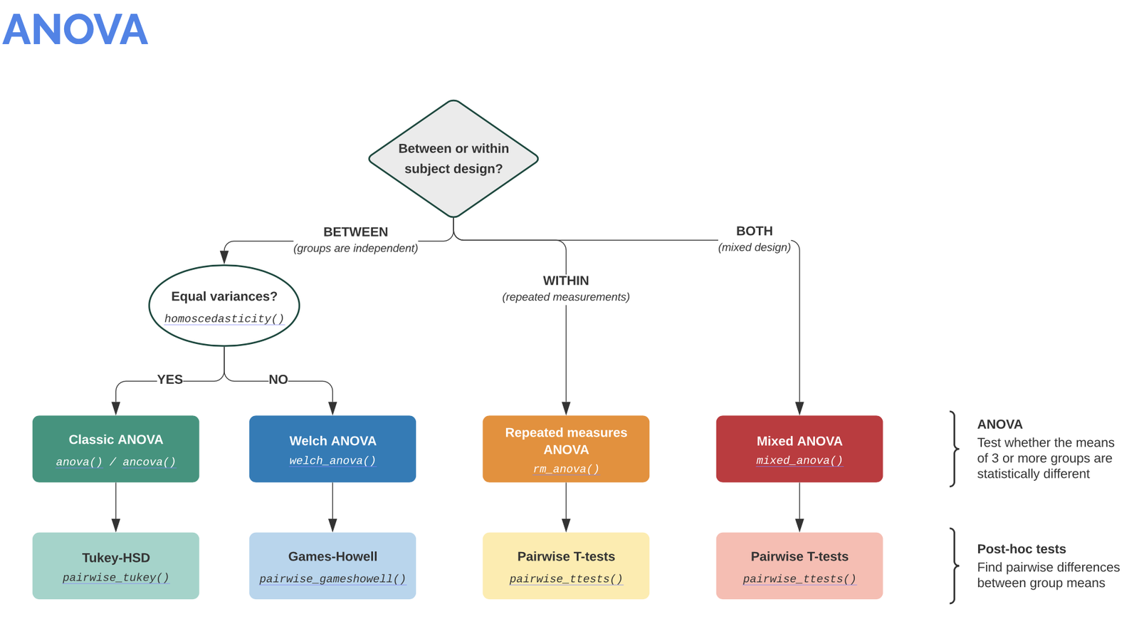
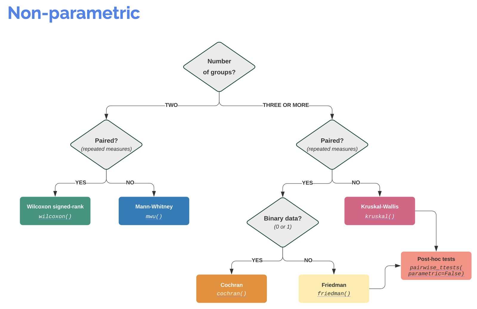
Info: It is worth visiting the Pingouin website ꜛ. It provides a very good overview of available significance tests and also a decision tree that helps to select the correct test for the respective data set.
Screenshots from pingouin-stats.org/guidelines.html ꜛ (taken on March 2, 2021):
Let’s recap our last example from the Pandas chapter:
# Example from the Pandas chapter (just with the Violin plot):
import pandas as pd
import os

import numpy as np
import matplotlib.pyplot as plt
import pingouin as pg

# Define file paths:
file_path = "Data/Pandas_1/"
file_name_1 = "Group_A_data.xls"
file_name_2 = "Group_B_data.xls"

file_1 = os.path.join(file_path, file_name_1)
file_2 = os.path.join(file_path, file_name_2)

# Read the Excel files with Pandas into a Pandas Dataframe:
Group_A_df = pd.read_excel(file_1, index_col=0)
Group_B_df = pd.read_excel(file_2, index_col=0)

# Broadcast the DataFrame data into the appropriate variables:
Group_A = Group_A_df["Data"].values
Group_B = Group_B_df["Data"].values

# VIOLIN-PLOTS:
fig=plt.figure(3, figsize=(5,6))
fig.clf()

plt.violinplot([Group_A, Group_B], showmedians=True)

plt.xticks([1,2], labels=["A", "B"])
plt.xlabel("Groups")
plt.ylabel("measurements")
plt.title("Violin plot")
plt.tight_layout
# plt.ylim(-40, 40)
plt.show()
fig.savefig("violinplot with data.pdf", dpi=120)
Google Colab Users: If you are running the notebook in Google Colab, you need to enable the access to your files in your Google Drive. First, upload the provided excel files to your Google Drive; put them into a folder, e.g., called “Data/Pandas_1” in the root-directory of your Google Drive. Then, add the following commands to the imports of the code shown above:
from google.colab import drive
drive.mount('/content/drive')
and change file_path to:
file_path = "/content/drive/My Drive/Data/Pandas_1/"
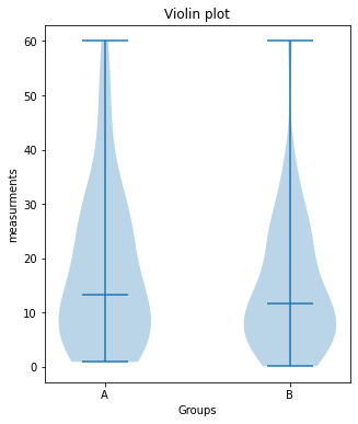
We would like to know whether the difference between the two groups is significant or not. Let’s assume, that our data is normally distributed and the two samples are independent. The corresponding test would be an unpaired, two-sample student’s t-test. The corresponding Pingouin command is the following:
test_result = pg.ttest(Group_A, Group_B, paired=False)
print(test_result)
| T | dof | tail | p-val | CI95% | cohen-d | BF10 | power | |
|---|---|---|---|---|---|---|---|---|
| T-test | 1.154936 | 98 | two-sided | 0.250925 | [-2.19, 8.28] | 0.230987 | 0.381 | 0.208113 |
As we can see, the output of this Pingouin command is not just a single value, e.g., the p-value, but a table. To be more correct, this table actually is a Pandas DataFrame. Besides the p-value (p-val), the DataFrame contains other useful statistical properties:
T: T-valuep-val: p-valuedof: degrees of freedomcohen-d: Cohen’s d effect size ꜛCI95%: 95% confidence intervals of the difference in meanspower: achieved power of the test ( = 1 - type II error)BF10: Bayes Factor of the alternative hypothesis
Note, that for DataFrames with many keys, by default the print command doesn’t print out all of them. To get a list of all available keys, use the command DataFrame.keys():
# applied to our test_result-DataFrame:
print(test_result.keys())
Index(['T', 'dof', 'tail', 'p-val', 'CI95%', 'cohen-d', 'BF10', 'power'], dtype='object')
To access the data of a specific key, just use the same syntax as for dictionaries and add “.values” in order to “extract” the value from the DataFrame structure:
print(f"the p-value of our test is:",
      f"{test_result['p-val'].values}")
the p-value of our test is: [0.25092508]
Exercise 1
Copy the solution of the Pandas example above into a new script. Extend your script by the following functionalities:
- Apply the significance test to the
Group_AandGroup_Bdata. - Write an if-statement that checks, whether the p-value of the significance test is lower or greater than 0.05. If the p-value is lower, then print out “there is a significant difference” together with the according p-value, otherwise print out “no significant difference” together with the according p-value.
- Plug-in the significance check-up into a function, e.g. named
unpaired_two_sample_ttest(...).
# Your solution 1.1 and 1.2 here:
no significant difference (p-value: [0.25092508])
Toggle solution
# Solution 1.1 and 1.2:
test_result = pg.ttest(Group_A, Group_B, paired=False)
p_value = test_result["p-val"].values

if p_value>0.05:
    print(f"no significant difference (p-value: {p_value})")
else:
    print(f"here is a significant difference (p-value: {p_value})")
# Your solution 1.3 here:
Group_A vs. Group_B:
no significant difference (p-value: [0.25092508])
Group_A vs. Group_B2:
significant difference (p-value: [0.02157014])
Toggle solution
# Solution 1.3:
import pandas as pd
import os
import numpy as np
import matplotlib.pyplot as plt
import pingouin as pg
# Define file paths:
file_path = "Data/Pandas_1/"
file_name_1 = "Group_A_data.xls"
file_name_2 = "Group_B_data.xls"
file_name_3 = "Group_B2_data.xls"
file_1 = os.path.join(file_path, file_name_1)
file_2 = os.path.join(file_path, file_name_2)
file_3 = os.path.join(file_path, file_name_3)
# Read the Excel files with Pandas into a Pandas Dataframe:
Group_A_df = pd.read_excel(file_1, index_col=0)
Group_B_df = pd.read_excel(file_2, index_col=0)
Group_B2_df= pd.read_excel(file_3, index_col=0)
# Broadcast the DataFrame data into the appropriate variables:
Group_A = Group_A_df["Data"].values
Group_B = Group_B_df["Data"].values
Group_B2= Group_B2_df["Data"].values
# DEFINE PLOT-FUNCTIONS:
def plot_violin(A, B, fignum, figaspect, the_title):
fig = plt.figure(fignum, figsize=figaspect)
fig.clf()
x_ticks_A = np.ones(len(A))
x_ticks_B = np.ones(len(B))
plt.violinplot([A, B], showmedians=True)
plt.xticks([1,2], labels=["A", "B"])
plt.xlabel("Groups")
plt.ylabel("measurements")
plt.title(the_title)
plt.tight_layout
# plt.ylim(-40, 40)
plt.show()
# DEFINE SIGNIFICANCE-TEST-FUNCTIONS:
def unpaired_two_sample_ttest(A, B):
test_result = pg.ttest(A, B, paired=False)
p_value = test_result["p-val"].values
if p_value>0.05:
print(f"no significant difference (p-value: {p_value})")
else:
print(f"significant difference (p-value: {p_value})")
# Our actual analysis:
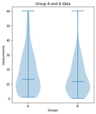
plot_violin(Group_A, Group_B, 7, (5,6), "Group A and B data")
print("Group_A vs. Group_B:")
unpaired_two_sample_ttest(Group_A, Group_B)
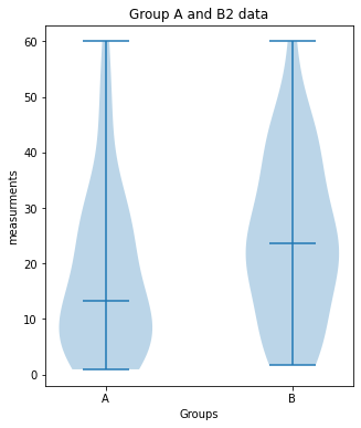
plot_violin(Group_A, Group_B2, 7, (5,6), "Group A and B2 data")
print("Group_A vs. Group_B2:")
unpaired_two_sample_ttest(Group_A, Group_B2)Outlook
Now imagine, that you have several Excel files to be read and processed. In this case it’s highly recommended to plug-in, e.g., the data import and the analysis part into for-loops, while the imported data have to be plugged into iterable NumPy Arrays. Also think about that you have several data project folders and you don’t want to look into each of them. In order prevent your routine from crashing, you could implement an if-statement that checks during the data import, whether files could be imported or not. And, whenever possible, plug-in complex and repetitive calculations and procedures into a function definition in order to keep your code readable and to save lines of unnecessary code.