Statistical data analysis with Pandas and Pingouin (extended)
![]()
![]()
This chapter is an extension of the Statistical data analysis with Pingouin and Reading data with Pandas chapter from the Python Basics course.
We start again from scratch and first create an artificial test data set:
Exercise 1: Create some dummy data samples
- Create a new script and define the following NumPy arrays as dummy data arrays:
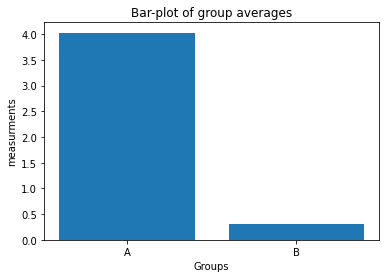
np.random.seed(1) Group_A = np.random.randn(10) * 10 + 5 Group_B = np.random.randn(10) * 10 + 2 - Plot the averages of
Group_AandGroup_Bin a bar-plot in a new figure window:-
use the plot command:
plt.bar([1, 2], ["Mean of Group A", "Mean of Group B"]).Hint: “Mean of Group A” and “Mean of Group B” are just placeholders! Replace this with the according NumPy averaging command :-)
- define the x-tick labels via
plt.xticks([1,2], labels=["A", "B"]) - add appropriate x- and y-labels and a title to your plot.
- save your plot as a PDF.
-
- Plot the values of
Group_AandGroup_B, respectively, in a boxplot in another figure window:- set the figure aspect ratio to 5x6 via
fig=plt.figure(2, figsize=(5,6)) - use the plot command
plt.boxplot([Group_A, Group_B]) - define the x-tick labels as in 2.
- add appropriate x- and y-labels and a title to your plot.
- save your plot as a PDF.
- set the figure aspect ratio to 5x6 via
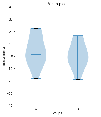
- Same as 3., but now use the command
plt.violinplot([Group_A, Group_B], showmedians=True)to plot a violin plot in another figure.
# Your solution 1.1-1.2 here
Toggle solution
# Solution 2.1
import numpy as np
import matplotlib.pyplot as plt

# Generate some random dummy data:
np.random.seed(1)
Group_A = np.random.randn(10)*10+5
Group_B = np.random.randn(10)*10+2

# Solution 2.2
fig=plt.figure(1)
fig.clf()

plt.bar([1, 2], [Group_A.mean(), Group_B.mean()])

plt.xticks([1,2], labels=["A", "B"])
plt.xlabel("Groups")
plt.ylabel("measurements")
plt.title("Bar-plot of group averages")

plt.tight_layout
plt.show()
fig.savefig("barplot.pdf", dpi=120)
# Your solution 1.3 here:
Toggle solution
# Solution 1.3:
fig=plt.figure(3, figsize=(5,6))
fig.clf()

#x_ticks_A = np.ones(len(Group_A))
#x_ticks_B = np.ones(len(Group_B))

plt.boxplot([Group_A, Group_B])

plt.xticks([1,2], labels=["A", "B"])
plt.xlabel("Groups")
plt.ylabel("measurements")
plt.title("Boxplot diagram")

plt.tight_layout
plt.show()
fig.savefig("boxlot.pdf", dpi=120)
# Your solution 1.4 here:
Toggle solution
# Solution 1.4
fig=plt.figure(3, figsize=(5,6))
fig.clf()

#x_ticks_A = np.ones(len(Group_A))
#x_ticks_B = np.ones(len(Group_B))

plt.violinplot([Group_A, Group_B], showmedians=True)
plt.boxplot([Group_A, Group_B])

plt.xticks([1,2], labels=["A", "B"])
plt.xlabel("Groups")
plt.ylabel("measurements")
plt.title("Violin plot")

plt.tight_layout
plt.xlim(0.5, 2.5)
plt.ylim(-40, 40)

plt.show()
fig.savefig("violinplot.pdf", dpi=120)
Statistical significance test
We would like to know, whether the difference between the two groups is significant or not.
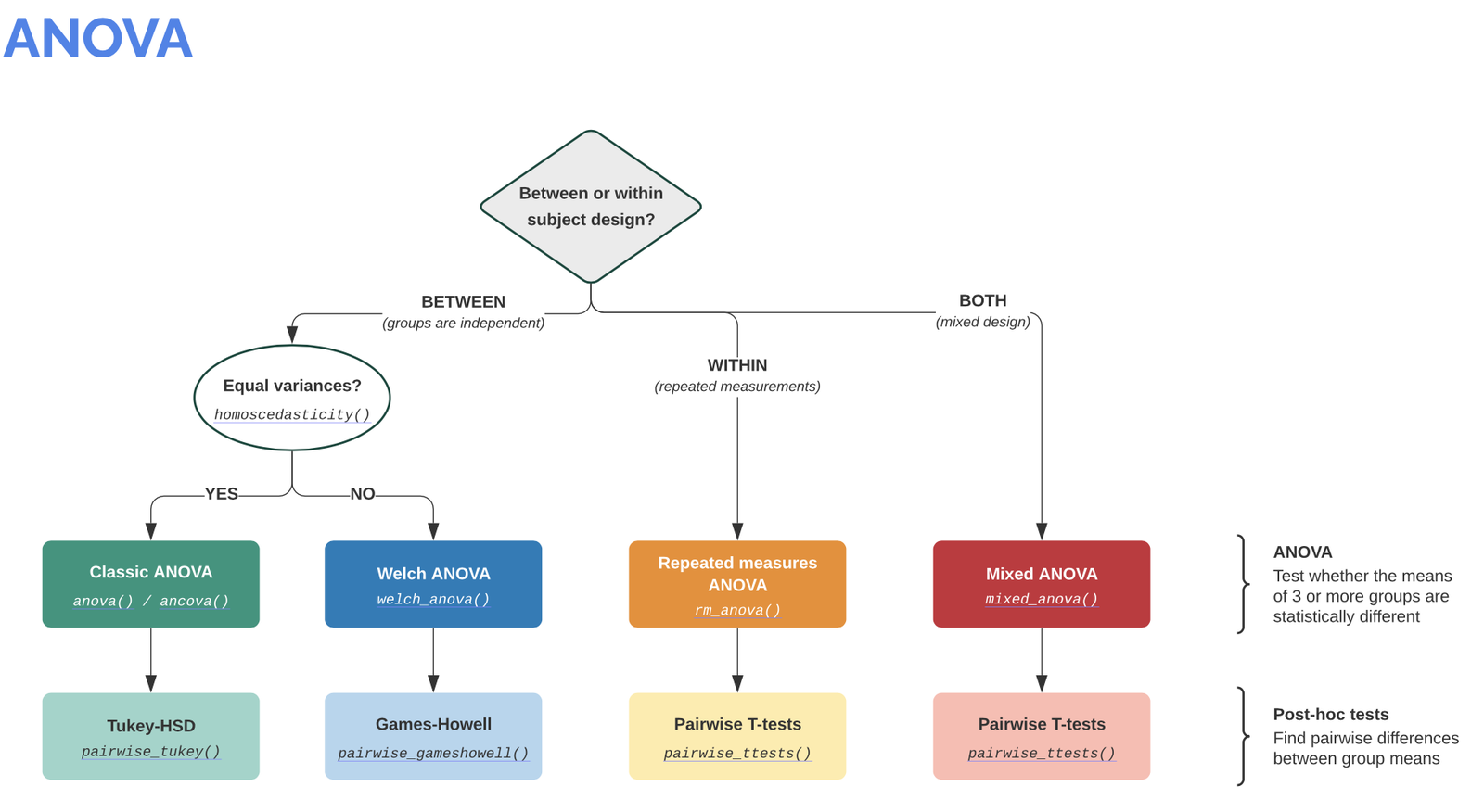
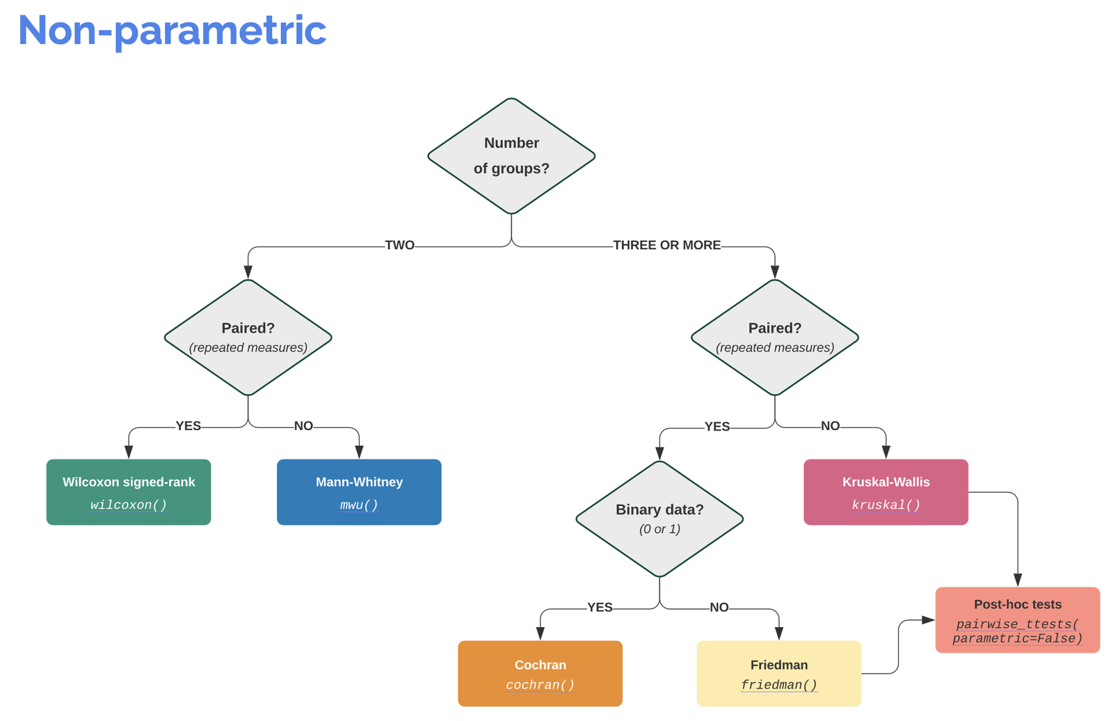
To perform a significance test in Python we use Pingouin ꜛ, a compact package that provides the most important test tools for a significance study.

Info: It is worth visiting the Pingouin website ꜛ. It provides a very good overview of available significance tests and also a decision tree that helps to select the correct test for the respective data set.
Screenshots from pingouin-stats.org/guidelines.html (taken on March 2, 2021):
Let’s assume that our data is normally distributed and the two samples are independent. The corresponding test would be an unpaired, two-sample student’s t-test. The corresponding Pingouin command is:
import pingouin as pg
test_result = pg.ttest(Group_A, Group_B, paired=False)
#print(test_result)
pg.ttest(Group_A, Group_B, paired=False)
| T | dof | tail | p-val | CI95% | cohen-d | BF10 | power | |
|---|---|---|---|---|---|---|---|---|
| T-test | 0.718772 | 18 | two-sided | 0.481509 | [-7.16, 14.61] | 0.321445 | 0.477 | 0.104604 |
As we can see, the output of Pingouin is not just a single value, e.g., the p-value, but a table of useful statistical properties:
T: T-valuep-val: p-valuedof: degrees of freedomcohen-d: Cohen’s d effect size ꜛCI95%: 95% confidence intervals of the difference in meanspower: achieved power of the test ( = 1 - type II error)BF10: Bayes Factor of the alternative hypothesis
To be more correct, this output is actually a so-called Pandas DataFrame, a type of variable construct. Pandas DataFrames are a handy and powerful representation of tables in Python, which has - similar to a 2D NumPy array - rows and columns, that can be directly accessed via their column names, called key (similar to the keys of dictionaries). In very long tables/DataFrames, by default not all columns/keys are shown. To get a list of all available keys, use the following command: DataFrame.keys()
# show all keys of the test_result DataFrame:
print(test_result.keys())
Index(['T', 'dof', 'tail', 'p-val', 'CI95%', 'cohen-d', 'BF10', 'power'], dtype='object')
To access a specific column/key, just use the same syntax as for dictionaries and add .values (in order to extract the values from the DataFrame structure and retrieve a NumPy array):
print(f"the p-value of our test is:",
      f"{test_result['p-val'].values}")
the p-value of our test is: [0.48150881]
Exercise 2
Add a new cell to the script of the solution from Exercise 1. In the new cell, extend your script by the following functions:
- Write an if-statement that checks whether the p-value of the significance test is lower or greater than 0.05. If the p-value is lower, then print out “there is a significant difference” together with the according p-value. Otherwise print out “no significant difference”, again, together with the according p-value.
- Extent your if-statement, so that also Cohen’s d effect size is printed out, but only if the p-value indicates a significant difference.
- Plug both, the significance test and your written if-statement into a function called
normal_unpaired_sigtest(A, B), which also returns the p-value back to your main script. - In your main script, call your newly created function with the
Group_AandGroup_Bdata. - Modify the
Group_Adefinition byGroup_A = np.random.randn(10)*10+15and re-run your script. - Create another function for the two-sample, non-parametric, un-paired significance test:
- visit pingouin-stats.org/guidelines.html to find the appropriate test
- copy your function from 2. and rename the copy to
notnormal_unpaired_sigtest(A, B) - adjust the significance test according to your website search result.
# Your solution 2.2 - 2.4:
no significant difference (p-value: [0.48150881])
Toggle solution
# Solution 2.2 - 2.4:
def normal_unpaired_sigtest(A, B):
    test_result = pg.ttest(A, B, paired=False)
    p_value = test_result["p-val"].values
    cohen_d = test_result["cohen-d"].values

    if p_value>0.05:
        print(f"no significant difference (p-value: {p_value})")
    else:
        print(f"here is a significant difference "
              f"(p-value: {p_value}, cohen-d:{cohen_d})")

    return p_value

pvalue = normal_unpaired_sigtest(Group_A, Group_B)
# Your solution 2.6 here:
no significant difference (p-value: [0.42735531])
Toggle solution
# Solution 2.6:
def notnormal_unpaired_sigtest(A, B):
    test_result = pg.mwu(A, B)
    p_value = test_result["p-val"].values

    if p_value>0.05:
        print(f"no significant difference (p-value: {p_value})")
    else:
        print(f"here is a significant difference "
              f"(p-value: {p_value})")

    return p_value

pvalue = notnormal_unpaired_sigtest(Group_A, Group_B)
Toggle full code solution
# Solution 2 (full code):
import numpy as np
import matplotlib.pyplot as plt
# %% Generate some random dummy data:
np.random.seed(1)
Group_A = np.random.randn(10)*10+5
Group_B = np.random.randn(10)*10+2
Group_B2= np.random.randn(10)*10+20
# %% FUNCTION DEFINITION
"""not a rule, but usually you place functions at the beginning
of your script (e.g. after the imports) to a) quickly find
them and b) they have to be defined before their first call.
"""
def normal_unpaired_sigtest(A, B):
test_result = pg.ttest(A, B, paired=False)
p_value = test_result["p-val"].values
cohen_d = test_result["cohen-d"].values
if p_value>0.05:
print(f"no significant difference (p-value: {p_value})")
else:
print(f"here is a significant difference "
f"(p-value: {p_value}, cohen-d:{cohen_d})")
return p_value, cohen_d
def notnormal_unpaired_sigtest(A, B):
test_result = pg.mwu(A, B)
p_value = test_result["p-val"].values
if p_value>0.05:
print(f"no significant difference (p-value: {p_value})")
else:
print(f"here is a significant difference "
f"(p-value: {p_value})")
return p_value
# %% PLOTS
# BAR-PLOT:
fig=plt.figure(1)
fig.clf()
plt.bar([1, 2], [Group_A.mean(), Group_B.mean()])
plt.xticks([1,2], labels=["A", "B"])
plt.xlabel("Groups")
plt.ylabel("measurements")
plt.title("Bar-plot of group averages")
plt.tight_layout
plt.show()
# VIOLIN-PLOTS:
def my_violin_AB_plot(A, B, A_label="A", B_label="B",
title=""):
""" This is Group A vs Group B Violin plot function.
Written by me on 2021, April
A Group A sample data
B Group B sample data
A_label....
"""
fig=plt.figure(3, figsize=(5,6))
fig.clf()
x_ticks_A = np.ones(len(A))
x_ticks_B = np.ones(len(B))
plt.violinplot([A, B], showmedians=True)
plt.boxplot([A, B])
plt.xticks([1,2], labels=[A_label, B_label])
plt.xlabel("Groups")
plt.ylabel("measurements")
plt.title(title)
plt.tight_layout
# plt.ylim(-40, 40)
# some add-on commands (remove some borders):
axis = plt.gca()
axis.spines['right'].set_visible(False)
axis.spines['top'].set_visible(False)
axis.spines['bottom'].set_visible(False)
axis.spines['left'].set_visible(False)
plt.show()
""" OLD:
fig=plt.figure(3, figsize=(5,6))
fig.clf()
x_ticks_A = np.ones(len(Group_A))
x_ticks_B = np.ones(len(Group_B))
plt.violinplot([Group_A, Group_B], showmedians=True)
plt.xticks([1,2], labels=["A", "B"])
plt.xlabel("Groups")
plt.ylabel("measurements")
plt.title("Violin plot")
plt.tight_layout
# plt.ylim(-40, 40)
plt.show()
"""
# Group A vs B:
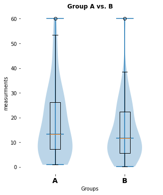
my_violin_AB_plot(A=Group_A, B=Group_B, A_label="A", B_label="B",
title="Group A vs. B")
pvalue_1, cohen_d_1 = normal_unpaired_sigtest(Group_A, Group_B)
# Group A vs B2:
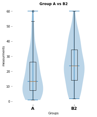
my_violin_AB_plot(A=Group_A, B=Group_B2, A_label="A",
B_label="B 2", title="Group A vs. B2")
pvalue_3, cohen_d_3 = normal_unpaired_sigtest(Group_A, Group_B2)
# SIGNIFICANCE TEST:
#pvalue_1, cohen_d_1 = normal_unpaired_sigtest(Group_A, Group_B)
#pvalue_2 = notnormal_unpaired_sigtest(Group_A, Group_B)
#pvalue_3, cohen_d_3 = normal_unpaired_sigtest(Group_A, Group_B2)
#print(f"again p-value1: {pvalue_1} and cohen's 1: {cohen_d_1}")Let’s apply the analysis to real world data
In order to import some data, which are stored in Excel files, we use the Pandas command pd.read_excel(path_to_file, index_col=0):
import pandas as pd
import os

import numpy as np
import matplotlib.pyplot as plt
import pingouin as pg

# Define file paths:
file_path = "Data/Pandas_1/"

""" file_path is the main root path.

    The definition above is a so-called relative file path -
    relative from the folder, that contains the script you
    are currently executing.

    A so-called absolute path (and therefore independent from
    your script's folder) can be defined as follows:

    file_path = "/Users/Fabrizio/Python/Kurs/Data/Pandas_1/"

    or

    file_path = "C:/Users/Fabrizio/Python/Kurs/Data/Pandas_1/"

    (adjust this to the absolute path on YOUR machine!)
"""

file_name_1 = "Group_A_data.xls"
file_name_2 = "Group_B_data.xls"

file_1 = os.path.join(file_path, file_name_1)
#  actually it does: file_1 = file_path + file_name_1
file_2 = os.path.join(file_path, file_name_2)

""" The os.path.join() command just sticks the different
    file-path components together. You can also just write:

    file_1 = file_path + file_name_1
    file_2 = file_path + file_name_2

    Never forget to put the required '/' at the end of
    the file_path definition::

       file_path = "Data/Pandas_1/"  ⟵ okay
       file_path = "Data/Pandas_1"   ⟵ not okay
"""

# Read the Excel files with Pandas into a Pandas Dataframe:
Group_A_df = pd.read_excel(file_1, index_col=0)
Group_B_df = pd.read_excel(file_2, index_col=0)

# some print test:
Group_A_df.iloc[0:10] # with the iloc command we can access
                      # DataFrame rows by standard indexing and
                      # slicing rules. Here, we didn't want to
                      # print out all rows of the DataFrame.
#print(Group_A_df.iloc[0:10])
| Data | |
|---|---|
| 0 | 18.074201 |
| 1 | 13.086849 |
| 2 | 2.272670 |
| 3 | 20.283832 |
| 4 | 26.357661 |
| 5 | 45.342706 |
| 6 | 47.139108 |
| 7 | 1.427794 |
| 8 | 7.846927 |
| 9 | 26.665037 |
The two Excel files are imported as DataFrames into Group_A_df and Group_B_df, respectively. In the next step, we extract the DataFrame data into two NumPy arrays:
# Extracting the DataFrame import data:
Group_A = Group_A_df["Data"].values
Group_B = Group_B_df["Data"].values
A few Pandas basics
As stated in the introductory course, Pandas can do much more than just Excel file reading. The Pandas DataFrame comes – similar to NumPy – equipped with a bunch of useful built-in function:
print(f"shape of Group A data: {Group_A_df.shape}")
print(f"shape of Group B data: {Group_B_df.shape}")
shape of Group A data: (50, 1)
shape of Group B data: (50, 1)
We see that the data of our two groups is one-dimensional, and
print(f"keys (columns) in Group A data: {Group_A_df.keys()}")
print(f"keys (columns) in Group B data: {Group_B_df.keys()}")
keys (columns) in Group A data: Index(['Data'], dtype='object')
keys (columns) in Group B data: Index(['Data'], dtype='object')
the main (and only - take a look at the Excel files-) column’s key-name is “Data”.
We can do some further first examination of our data:
print(f"first 5 rows in Group A data: {Group_A_df.head(5)}")
first 5 rows in Group A data: Data
0 18.074201
1 13.086849
2 2.272670
3 20.283832
4 26.357661
print(f"last 5 rows in Group A data: {Group_A_df.tail(5)}")
last 5 rows in Group A data: Data
45 24.808727
46 9.782053
47 2.438080
48 31.641609
49 24.247804
print(f"average of Group A data: {Group_A_df.mean().values}",
      f"+/- {Group_A_df.std().values}",)
print(f"average of Group B data: {Group_B_df.mean().values}",
      f"+/- {Group_B_df.std().values}",)
average of Group A data: [17.47999084] +/- [14.40494573]
average of Group B data: [14.43276578] +/- [11.85600989]
# general descriptive statistics of your dataframe:
Group_A_df.describe()
| Data | |
|---|---|
| count | 50.000000 |
| mean | 17.479991 |
| std | 14.404946 |
| min | 0.922640 |
| 25% | 7.307007 |
| 50% | 13.226441 |
| 75% | 26.161001 |
| max | 60.000000 |
Exercise 3
- Copy your script from the Pingouin Exercise 2.
- Add the Pandas Excel file import commands from above to your script.
- Uncomment or redefine your
Group_AandGroup_Bvariable definitions by the following expression:Group_A = Group_A_df["Data"].values Group_B = Group_B_df["Data"].values - Run your new script.
- Now, instead of reading the file “Group_B_data.xls”, read “Group_B2_data.xls” as Group B data and re-run your script
# Your solution 3 here (full script):
here is a significant difference (p-value: [0.02157014], cohen-d:[0.46704775])
Toggle full script solution
# Solution 3 (Full script):
import pandas as pd
import os
import numpy as np
import matplotlib.pyplot as plt
import pingouin as pg
# Define file paths:
file_path = "Data/Pandas_1/"
file_name_1 = "Group_A_data.xls"
file_name_2 = "Group_B_data.xls"
file_name_3 = "Group_B2_data.xls"
file_1 = os.path.join(file_path, file_name_1)
file_2 = os.path.join(file_path, file_name_2)
file_3 = os.path.join(file_path, file_name_3)
# Read the Excel files with Pandas into a Pandas Dataframe:
Group_A_df = pd.read_excel(file_1, index_col=0)
Group_B_df = pd.read_excel(file_2, index_col=0)
Group_B2_df= pd.read_excel(file_3, index_col=0)
# Broadcast the DataFrame data into the appropriate variables:
Group_A = Group_A_df["Data"].values
Group_B = Group_B_df["Data"].values
Group_B2= Group_B2_df["Data"].values
""" The following code is simply your copied solution from the
Pingouin section:
"""
# %% FUNCTION DEFINITIONS
def normal_unpaired_sigtest(A, B):
test_result = pg.ttest(A, B, paired=False)
p_value = test_result["p-val"].values
cohen_d = test_result["cohen-d"].values
if p_value>0.05:
print(f"no significant difference (p-value: {p_value})")
else:
print(f"here is a significant difference "
f"(p-value: {p_value}, cohen-d:{cohen_d})")
return p_value, cohen_d
def notnormal_unpaired_sigtest(A, B):
test_result = pg.mwu(A, B)
p_value = test_result["p-val"].values
if p_value>0.05:
print(f"no significant difference (p-value: {p_value})")
else:
print(f"here is a significant difference "
f"(p-value: {p_value})")
return p_value
# VIOLIN-PLOTS:
def my_violin_AB_plot(A, B, A_label="A", B_label="B",
title=""):
""" This is Group A vs Group B Violin plot function.
Written by me on 2021, April
A Group A sample data
B Group B sample data
A_label....
"""
fig=plt.figure(3, figsize=(5,6))
fig.clf()
x_ticks_A = np.ones(len(A))
x_ticks_B = np.ones(len(B))
plt.violinplot([A, B], showmedians=True)
plt.boxplot([A, B])
plt.xticks([1,2], labels=[A_label, B_label], fontsize=14,
fontweight="bold")
plt.xlabel("Groups")
plt.ylabel("measurements")
plt.title(title, fontweight="bold")
plt.tight_layout
# plt.ylim(-40, 40)
# some add-on commands (remove some borders):
axis = plt.gca()
axis.spines['right'].set_visible(False)
axis.spines['top'].set_visible(False)
axis.spines['bottom'].set_visible(False)
axis.spines['left'].set_visible(False)
plt.show()
# BAR-PLOT:
def my_bar_AB_plot(A, B, A_label="A", B_label="B", title="",
plotfilename="plot.pdf"):
fig=plt.figure(1, figsize=(3,5))
fig.clf()
plt.bar([1, 2], [A.mean(), B.mean()], alpha=0.25)
plt.xticks([1,2], labels=[A_label, B_label])
plt.xlabel("Groups")
plt.ylabel("measurements")
#plt.title("Bar-plot of group averages")
plt.title(title, fontweight="bold")
# some add-on commands (remove some borders):
axis = plt.gca()
axis.spines['right'].set_visible(False)
axis.spines['top'].set_visible(False)
axis.spines['bottom'].set_visible(False)
axis.spines['left'].set_visible(False)
plt.tight_layout
plt.show()
# eg here the plot-save commands:
plt.savefig(plotfilename)# please wait for check up.
# %% STATISTICAL ANALYSIS AND PLOT:
""" Please note, that the following 3 commands per group
comparison has become the MAIN PART OF OUR ANALYSIS
script, i.e., only execute these three commands to
get your plots and significance test. How the significance test is calculated and how the plots are
generated is done in our function, which we don't have
to touch, change and care about anymore.
"""
# Group A vs B:
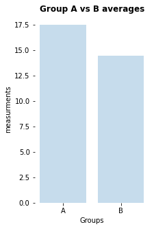
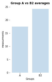
my_bar_AB_plot(A=Group_A, B=Group_B, A_label="A", B_label="B",
title="Group A vs B averages",
plotfilename="bar_plot_AB.pdf")
my_violin_AB_plot(A=Group_A, B=Group_B, A_label="A", B_label="B",
title="Group A vs. B")
pvalue_1, cohen_d_1 = normal_unpaired_sigtest(Group_A, Group_B)
# Group A vs B2:
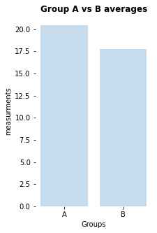
my_bar_AB_plot(A=Group_A, B=Group_B2, A_label="A", B_label="B2",
title="Group A vs B2 averages",
plotfilename="bar_plot_AB2.pdf")
my_violin_AB_plot(A=Group_A, B=Group_B2, A_label="A",
B_label="B2", title="Group A vs B2")
pvalue_3, cohen_d_3 = normal_unpaired_sigtest(Group_A, Group_B2)Exercise 4: Extended real world data example
In the second part of our statistics tutorial we expand our script, so that it can analyze Excel tables with more than just one column. Also, we work with .xlsx files instead of .xls files. Unfortunately, I just discovered that xlrd has explicitly removed the support for anything other than .xls files (due to “potential security vulnerabilities”, source ꜛ). To overcome this problem, please install the
openpyxl
package.
- Copy the Excel file reading part from your previous script (or copy it from “Solution 3 (Full script)”) into a new script.
- Change the main data path to
Data/Pandas_3/and adjust the file names to the Group A and Group B data in that folder. - In order to be able to read
.xlsxfiles, add the argumentengine='openpyxlto the Pandas read command, e.g.pd.read_excel(file_1, index_col=0, engine='openpyxl') - Similar to dictionaries, print out all column names (“
keys”) of the read Excel files, e.g.:for key in Group_A_df.keys(): print(f"{key}")
# Your solution 4.1-4.4 here:
Mouse 1
Mouse 2
Mouse 3
Mouse 4
Mouse 5
Mouse 6
Mouse 7
Mouse 8
Mouse 9
Mouse 10
Toggle solution
import pandas as pd
import os

import numpy as np
import matplotlib.pyplot as plt
import pingouin as pg

# Define file paths:
file_path = "Data/Pandas_3/"
#file_name_1 = "Group_A_data_2.xlsx"
#file_name_2 = "Group_B_data_2.xlsx"
file_name_1 = "Group_A_data.xlsx"
file_name_2 = "Group_B_data.xlsx"

file_1 = os.path.join(file_path, file_name_1)
file_2 = os.path.join(file_path, file_name_2)

# Read the Excel files with Pandas into a Pandas Dataframe:
Group_A_df = pd.read_excel(file_1, index_col=0, engine='openpyxl')
Group_B_df = pd.read_excel(file_2, index_col=0, engine='openpyxl')

for column in Group_A_df.keys():
print(f"{column}")Group_A_df.keys()
Index(['Mouse 1', 'Mouse 2', 'Mouse 3', 'Mouse 4', 'Mouse 5', 'Mouse 6', 'Mouse 7', 'Mouse 8', 'Mouse 9', 'Mouse 10'], dtype='object')
Group_A_df.head(7)
| Mouse 1 | Mouse 2 | Mouse 3 | Mouse 4 | Mouse 5 | Mouse 6 | Mouse 7 | Mouse 8 | Mouse 9 | Mouse 10 | |
|---|---|---|---|---|---|---|---|---|---|---|
| 0 | 18.074201 | 23.066936 | 60.000000 | 20.711322 | 60.000000 | 28.763525 | 42.427278 | 15.598740 | 13.465411 | 13.196517 |
| 1 | 13.086849 | 10.323111 | 19.974086 | 38.248952 | 25.587832 | 53.735452 | 16.635397 | 16.495615 | 44.782381 | 23.109105 |
| 2 | 2.272670 | 17.602005 | 22.705996 | 19.140288 | 24.739332 | 12.594575 | 41.966899 | 13.633330 | 25.891547 | 14.908281 |
| 3 | 20.283832 | 28.179423 | 36.580909 | 38.064844 | 29.033290 | 9.057918 | 60.000000 | 20.301198 | 18.622461 | 13.755511 |
| 4 | 26.357661 | 60.000000 | 29.650851 | 20.149923 | 44.583438 | 5.217009 | 48.860477 | 37.083126 | 18.306000 | 9.591119 |
| 5 | 45.342706 | 9.259463 | 10.029454 | 35.167710 | 14.413221 | 26.552184 | 3.281541 | 9.668325 | 15.764203 | 19.503650 |
| 6 | 47.139108 | 25.335681 | 10.954845 | 19.216845 | 45.489924 | 48.642575 | 26.566834 | 3.103062 | 12.845208 | 34.832844 |
print(Group_A_df.shape)
(50, 10)
#print(Group_A_df.describe())
Group_A_df.describe()
| Mouse 1 | Mouse 2 | Mouse 3 | Mouse 4 | Mouse 5 | Mouse 6 | Mouse 7 | Mouse 8 | Mouse 9 | Mouse 10 | |
|---|---|---|---|---|---|---|---|---|---|---|
| count | 50.000000 | 50.000000 | 50.000000 | 50.000000 | 50.000000 | 50.000000 | 50.000000 | 50.000000 | 50.000000 | 50.000000 |
| mean | 17.479991 | 24.648196 | 27.360234 | 26.124974 | 28.200733 | 18.042231 | 21.736532 | 18.573062 | 26.391034 | 24.842926 |
| std | 14.404946 | 14.363733 | 12.986157 | 11.570712 | 11.908364 | 13.552271 | 15.680920 | 13.948133 | 12.477335 | 12.394661 |
| min | 0.922640 | 9.259463 | 9.270425 | 9.429189 | 9.777123 | 0.062906 | 0.376473 | 0.472434 | 9.382286 | 9.549946 |
| 25% | 7.307007 | 13.435652 | 19.699324 | 18.230936 | 18.421391 | 7.620068 | 7.607388 | 7.634176 | 17.837596 | 14.267775 |
| 50% | 13.226441 | 19.900726 | 24.955239 | 24.172694 | 26.158784 | 14.903794 | 18.857441 | 16.047178 | 23.196840 | 23.064810 |
| 75% | 26.161001 | 28.072406 | 33.454855 | 32.736302 | 34.073416 | 27.297384 | 35.213392 | 26.562242 | 34.536572 | 31.782738 |
| max | 60.000000 | 60.000000 | 60.000000 | 60.000000 | 60.000000 | 53.735452 | 60.000000 | 56.025684 | 60.000000 | 60.000000 |
Exercise 4 continued:
- Calculate and print the median of each column of each data table. Hint: Take a look, how we calculated the mean with the built-in Pandas mean function shown in Section 5.
- Save the calculated medians into the variables
Group_AandGroup_B. - Copy the remaining plot and analysis part from your previous script/”Solution 3 (Full script)” into your script and run your pipeline.
- Re-run your script with the Group A2 and Group B2 data.
# Your solution 4c.1-4c.2 here:
Group A medians: [13.22644106 19.90072561 24.95523869 24.17269392 26.15878378 14.9037943 18.85744129 16.04717778 23.19683969 23.06480993]
Group B medians: [23.59495388 11.61376136 18.68395653 20.8270858 21.82640825 14.64554514 20.27448066 17.02615332 11.41902818 17.77334372]
Toggle solution
# Solution 4c.1-4c.2:
Group_A = Group_A_df.median().values
Group_B = Group_B_df.median().values
print(f"Group A medians: {Group_A}")
print(f"Group B medians: {Group_B}")print(f"{type(Group_A_df)}")
print(f"{type(Group_A)}")
<class 'pandas.core.frame.DataFrame'>
<class 'numpy.ndarray'>
dummy = Group_A_df.values
print(f"{type(dummy)}")
print(f"{dummy.shape}")
<class 'numpy.ndarray'>
(50, 10)
# the other way around: create a new dataframe from a given
# NumPy array:
df2 = pd.DataFrame(data=dummy)
df2
| 0 | 1 | 2 | 3 | 4 | 5 | 6 | 7 | 8 | 9 | |
|---|---|---|---|---|---|---|---|---|---|---|
| 0 | 18.074201 | 23.066936 | 60.000000 | 20.711322 | 60.000000 | 28.763525 | 42.427278 | 15.598740 | 13.465411 | 13.196517 |
| 1 | 13.086849 | 10.323111 | 19.974086 | 38.248952 | 25.587832 | 53.735452 | 16.635397 | 16.495615 | 44.782381 | 23.109105 |
| 2 | 2.272670 | 17.602005 | 22.705996 | 19.140288 | 24.739332 | 12.594575 | 41.966899 | 13.633330 | 25.891547 | 14.908281 |
| 3 | 20.283832 | 28.179423 | 36.580909 | 38.064844 | 29.033290 | 9.057918 | 60.000000 | 20.301198 | 18.622461 | 13.755511 |
| 4 | 26.357661 | 60.000000 | 29.650851 | 20.149923 | 44.583438 | 5.217009 | 48.860477 | 37.083126 | 18.306000 | 9.591119 |
| 5 | 45.342706 | 9.259463 | 10.029454 | 35.167710 | 14.413221 | 26.552184 | 3.281541 | 9.668325 | 15.764203 | 19.503650 |
| 6 | 47.139108 | 25.335681 | 10.954845 | 19.216845 | 45.489924 | 48.642575 | 26.566834 | 3.103062 | 12.845208 | 34.832844 |
| 7 | 1.427794 | 12.321790 | 31.902779 | 18.709343 | 22.324181 | 13.551915 | 20.291572 | 28.838343 | 41.150187 | 42.268679 |
| 8 | 7.846927 | 60.000000 | 26.200162 | 26.720212 | 19.633351 | 31.817556 | 33.593050 | 2.118014 | 40.808585 | 24.551126 |
| 9 | 26.665037 | 14.995325 | 20.649107 | 25.755907 | 18.867057 | 10.498226 | 2.170260 | 3.044227 | 13.793600 | 14.054273 |
| 10 | 0.922640 | 60.000000 | 11.326179 | 23.560684 | 22.050686 | 0.172303 | 32.466781 | 25.394094 | 23.179101 | 26.588131 |
| 11 | 4.326630 | 27.751354 | 21.395401 | 19.939066 | 23.044234 | 28.377354 | 41.063390 | 2.535108 | 47.836518 | 50.371135 |
| 12 | 9.157503 | 37.444383 | 22.488169 | 27.579036 | 33.046569 | 30.581410 | 24.489401 | 11.408426 | 12.707566 | 23.685907 |
| 13 | 29.647979 | 60.000000 | 10.276356 | 18.532377 | 50.371736 | 14.600049 | 6.179677 | 0.599478 | 9.884708 | 31.209116 |
| 14 | 8.742000 | 13.402487 | 13.829782 | 40.112201 | 33.829378 | 15.207540 | 7.091670 | 32.604269 | 30.323622 | 31.973945 |
| 15 | 25.571023 | 18.113789 | 30.915942 | 26.935311 | 45.771603 | 15.868325 | 9.154542 | 26.951625 | 24.522718 | 14.945380 |
| 16 | 10.862005 | 43.721057 | 54.936913 | 25.452780 | 34.154762 | 4.038185 | 13.411006 | 41.784804 | 20.798726 | 9.617624 |
| 17 | 4.951999 | 11.777482 | 19.827426 | 12.798417 | 34.864567 | 1.881381 | 50.341528 | 24.640953 | 13.600837 | 24.316330 |
| 18 | 12.602611 | 44.989141 | 31.756518 | 60.000000 | 50.767570 | 20.788953 | 10.415866 | 5.427315 | 32.450598 | 38.791586 |
| 19 | 11.634356 | 18.588259 | 24.700600 | 17.620996 | 43.425558 | 45.023374 | 21.967371 | 9.176215 | 27.008075 | 24.106791 |
| 20 | 34.598150 | 23.195795 | 26.490087 | 12.446582 | 30.696737 | 5.961492 | 2.909811 | 0.472434 | 39.430237 | 44.301112 |
| 21 | 8.010439 | 17.133937 | 21.597454 | 17.322758 | 12.003452 | 13.956856 | 17.423311 | 4.319208 | 49.054840 | 47.313228 |
| 22 | 14.213581 | 13.013907 | 42.684656 | 52.144749 | 43.825369 | 20.861080 | 39.967672 | 16.577972 | 13.891236 | 35.827849 |
| 23 | 17.283408 | 45.924542 | 51.593317 | 55.568849 | 33.648052 | 15.822137 | 35.904421 | 8.848024 | 24.704299 | 11.604016 |
| 24 | 7.231297 | 18.351918 | 15.818481 | 28.129001 | 31.764006 | 7.846267 | 22.262767 | 12.155190 | 25.912714 | 27.630061 |
| 25 | 37.431148 | 14.271629 | 10.372286 | 18.130455 | 9.777123 | 43.152748 | 3.728966 | 49.090144 | 18.187796 | 51.745546 |
| 26 | 60.000000 | 27.090419 | 28.996761 | 14.138737 | 44.961747 | 15.467501 | 2.651519 | 18.647221 | 19.375649 | 19.259184 |
| 27 | 15.263485 | 24.453000 | 39.158395 | 29.291996 | 24.467756 | 28.393238 | 30.909583 | 15.293277 | 35.231897 | 26.813921 |
| 28 | 19.726142 | 19.591767 | 17.227544 | 15.210792 | 31.066936 | 7.544668 | 17.086464 | 16.578254 | 21.923898 | 18.220372 |
| 29 | 53.398856 | 35.515243 | 24.882107 | 23.198237 | 16.201861 | 11.142045 | 0.376473 | 3.806705 | 37.843522 | 21.460346 |
| 30 | 1.999801 | 41.338417 | 19.234954 | 34.182026 | 15.984169 | 20.502174 | 37.557506 | 10.702520 | 18.995861 | 11.977590 |
| 31 | 23.165529 | 9.897616 | 10.463554 | 9.429189 | 15.821055 | 14.059610 | 5.548009 | 30.102911 | 18.080977 | 15.059878 |
| 32 | 17.817273 | 26.074054 | 26.262574 | 31.639008 | 13.894720 | 49.942595 | 0.544130 | 7.229560 | 27.405940 | 18.695652 |
| 33 | 26.506697 | 12.475491 | 28.759075 | 26.614726 | 29.884389 | 6.496984 | 13.228164 | 29.737218 | 19.913229 | 17.977265 |
| 34 | 1.204476 | 37.155684 | 9.270425 | 18.976416 | 34.428537 | 22.663872 | 12.654010 | 5.705055 | 17.756469 | 36.962189 |
| 35 | 7.534135 | 11.614547 | 30.238235 | 47.987283 | 20.302559 | 3.249226 | 17.072194 | 22.333842 | 9.382286 | 28.667410 |
| 36 | 10.269124 | 25.800587 | 49.434714 | 39.438373 | 32.977586 | 5.673104 | 1.781834 | 48.147802 | 49.861266 | 9.549946 |
| 37 | 1.679551 | 22.546229 | 25.028371 | 34.567647 | 15.254913 | 18.676291 | 39.989288 | 14.035692 | 26.532216 | 22.792065 |
| 38 | 34.870874 | 12.062923 | 33.691626 | 19.715068 | 18.272835 | 27.545784 | 1.809349 | 46.898462 | 18.139465 | 11.661021 |
| 39 | 3.548040 | 20.209684 | 19.656624 | 31.864163 | 25.997314 | 0.553830 | 35.753506 | 3.232649 | 17.635220 | 11.559999 |
| 40 | 13.366033 | 13.707039 | 34.500235 | 23.116394 | 27.482170 | 31.895751 | 12.781879 | 18.189214 | 17.681920 | 33.061807 |
| 41 | 3.950274 | 10.492658 | 33.823570 | 15.996040 | 19.019034 | 4.585402 | 22.200923 | 56.025684 | 40.288950 | 12.298093 |
| 42 | 4.664843 | 32.356748 | 35.535390 | 14.709471 | 17.504142 | 22.546489 | 27.582803 | 14.589289 | 48.318855 | 22.106622 |
| 43 | 8.136822 | 13.535150 | 21.903188 | 10.697075 | 10.426118 | 28.748127 | 16.332092 | 33.934607 | 26.286119 | 60.000000 |
| 44 | 28.295757 | 22.036282 | 48.424268 | 24.784703 | 41.437238 | 0.062906 | 40.008105 | 18.073233 | 23.214578 | 39.247507 |
| 45 | 24.808727 | 11.418740 | 24.051138 | 33.027015 | 24.838067 | 17.460130 | 12.595379 | 31.639951 | 10.456252 | 10.361826 |
| 46 | 9.782053 | 12.168356 | 32.744544 | 14.103582 | 32.015211 | 8.679609 | 25.330024 | 21.230605 | 60.000000 | 23.020514 |
| 47 | 2.438080 | 17.025026 | 14.555416 | 25.361097 | 15.838776 | 12.936283 | 5.739870 | 4.977422 | 29.575528 | 25.947061 |
| 48 | 31.641609 | 18.787834 | 21.511244 | 14.716543 | 26.320254 | 12.441082 | 43.123952 | 14.849948 | 44.978574 | 13.966244 |
| 49 | 24.247804 | 26.292905 | 60.000000 | 35.324496 | 17.926226 | 6.274465 | 29.598034 | 20.822737 | 21.749836 | 27.680942 |
df2.to_csv("Data/outcsv_df2.csv")
# there is also an Excel export. But I have to look it up (one
# needs an "ExcelWriter" module)
# Your solution 4c.3-4c.4 here:
no significant difference (p-value: [0.1858791])
Toggle solution
# Solution 4c.3-4c.4:
# %% FUNCTION DEFINITIONS
def normal_unpaired_sigtest(A, B):
test_result = pg.ttest(A, B, paired=False)
p_value = test_result["p-val"].values
cohen_d = test_result["cohen-d"].values
if p_value>0.05:
print(f"no significant difference (p-value: {p_value})")
else:
print(f"here is a significant difference "
f"(p-value: {p_value}, cohen-d:{cohen_d})")
return p_value, cohen_d
def notnormal_unpaired_sigtest(A, B):
test_result = pg.mwu(A, B)
p_value = test_result["p-val"].values
if p_value>0.05:
print(f"no significant difference (p-value: {p_value})")
else:
print(f"here is a significant difference "
f"(p-value: {p_value})")
return p_value
# VIOLIN-PLOTS:
def my_violin_AB_plot(A, B, A_label="A", B_label="B",
title=""):
""" This is Group A vs Group B Violin plot function.
Written by me on 2021, April
A Group A sample data
B Group B sample data
A_label....
"""
fig=plt.figure(3, figsize=(5,6))
fig.clf()
x_ticks_A = np.ones(len(A))
x_ticks_B = np.ones(len(B))
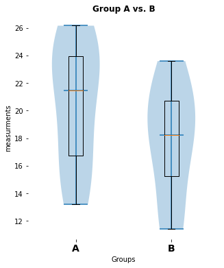
plt.violinplot([A, B], showmedians=True)
plt.boxplot([A, B])
plt.xticks([1,2], labels=[A_label, B_label], fontsize=14,
fontweight="bold")
plt.xlabel("Groups")
plt.ylabel("measurements")
plt.title(title, fontweight="bold")
plt.tight_layout
# plt.ylim(-40, 40)
# some add-on commands (remove some borders):
axis = plt.gca()
axis.spines['right'].set_visible(False)
axis.spines['top'].set_visible(False)
axis.spines['bottom'].set_visible(False)
axis.spines['left'].set_visible(False)
plt.show()
# BAR-PLOT:
def my_bar_AB_plot(A, B, A_label="A", B_label="B", title=""):
fig=plt.figure(1, figsize=(3,5))
fig.clf()
plt.bar([1, 2], [A.mean(), B.mean()], alpha=0.25)
plt.xticks([1,2], labels=[A_label, B_label])
plt.xlabel("Groups")
plt.ylabel("measurements")
#plt.title("Bar-plot of group averages")
plt.title(title, fontweight="bold")
# some add-on commands (remove some borders):
axis = plt.gca()
axis.spines['right'].set_visible(False)
axis.spines['top'].set_visible(False)
axis.spines['bottom'].set_visible(False)
axis.spines['left'].set_visible(False)
plt.tight_layout
plt.show()
# %% STATISTICAL ANALYSIS AND PLOT:
""" Please note, that the following 3 commands per group
comparison has become the MAIN PART OF OUR ANALYSIS
script, i.e., only execute these three commands to
get your plots and significance test. How the signi-
ficance test is calculated and how the plots are
generated is done in our function, which we don't have
to touch, change and care about anymore.
"""
# Group A vs B:
my_bar_AB_plot(A=Group_A, B=Group_B, A_label="A", B_label="B",
title="Group A vs B averages")
my_violin_AB_plot(A=Group_A, B=Group_B, A_label="A", B_label="B",
title="Group A vs. B")
pvalue_1, cohen_d_1 = normal_unpaired_sigtest(Group_A, Group_B)Outlook
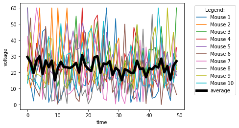
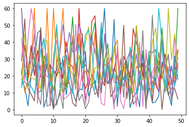
We can also easily and quickly plot all data columns of an Excel file via:
# Matplotlib:
plt.plot(Group_A_df)
# or use the Pandas built-in plot function:
Group_A_df.plot()
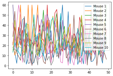
Also, we can easily plot the Grand average over all columns via:
#Group_A_df.plot()
Group_A_df.plot(xlabel="time", ylabel="voltage")
#Group_A_df.mean(axis=1).plot()
Group_A_df.mean(axis=1).plot(lw=5, c="k", label="average")
plt.legend(loc="best",bbox_to_anchor=(1.05, 1), title="Legend:")