Data exploration, dimensionality reduction and clustering with Napari
It is possible, to analyze the extracted feature tables from the image segmentations presented in the previous chapters from within Napari. However, Napari is not a dedicated data analysis tool. For more advanced data analysis, we recommend to export the feature tables and use a dedicated data analysis tool such as Python.
Exploring data in Napari
The required Napari plugins for data exploration are:
- napari-accelerated-pixel-and-object-classificationꜛ,
- napari-clusters-plotterꜛ, and
- napari-simpleitk-image-processingꜛ, as well as
- minimum one of the segmentation plugins presented in the previous chapters (global thresholding methods, Cellpose or StarDist.
If you haven’t installed Napari yet, please do so before proceeding with this tutorial. To practice this tutorial, install the following package(s) in your activated Napari conda environment:
conda install -y napari-accelerated-pixel-and-object-classification napari-clusters-plotter napari-simpleitk-image-processing cellpose-napari stardist-napari
Let’s work with the sample dataset “Human Mitosisꜛ” and perform a segmentation using StarDist:
 Segmenting the human mitosis dataset from the Napari sample image set with StarDist. How to use StarDist, please refer to the previous chapter.
The human mitosis sample set contains nuclei, some of which are mitotic. The goal is to explore the extracted features and try to identify hallmarks, that enable us to distinguish between mitotic and non-mitotic nuclei.
Parametric maps
A simple way to take a first look at specific features is by double-clicking on the corresponding column-header in the feature table. This will automatically create a new label layer, where the label color is determined by the values in the selected feature column. These feature label layers are also called parametric mapsꜛ:
 Visualizing features of feature table as parametric mapsꜛ.
Using the plot widget
It seems, that mitotic nuclei are smaller and brighter than non-mitotic cells. In order to further validate our hypothesis, we can utilize the Plotter Widget from the Plugins->napari-cluster-plotter menu. The widget allows to select two features from the feature table (it is necessary that the feature table has been created in advance) and to plot these two features against each other. Further more, within the widget’s plot window, we can select subsets of the data points and highlight them as a new layer in the Napari viewer by drawing a lasso around the desired data points. To select more than one subset, hold the “Shift” while selecting:
 Utilizing the
 Plot Widget for data exploration in Napari.
Dimensionality reduction
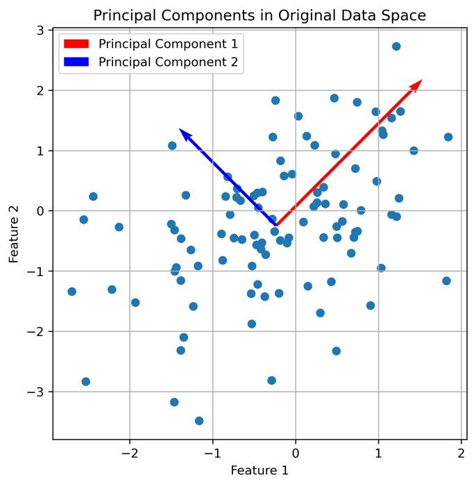
It seems that there is indeed a dependence on brightness and nuclei size for mitotic cells. We can further validate our assumption by performing a dimensionality reduction, now including some more features such as mean and maximum brightness. To do so, select from the Plugins->napari-cluster-plotter menu the Dimensionality Reduction Widget. In this widget, you can choose which features you’d like to include and which dimensionality reduction method you’d like to apply. Here, we choose PCA with two principal components and select the features mentioned above. The results if the dimensionality reduction will be added to the feature table. In order to plot them in the plot widget, we need to click on Update Axes/Clustering Options and select the according axes/feature columns:
 Performing a dimensionality reduction in Napari, here using PCA, and plotting the results in the
 Plotter Widget.
Clustering
Instead of selecting the subset of data points by drawing a lasso, i.e., manually “clustering” the data, we can also use the Cluster Widget from the Plugins->napari-cluster-plotter menu. Like for the Dimensionality Reduction Widget we can choose the features we’d like to cluster as well as which clustering algorithm we’d like to apply. Here we choose the the two principal components from the PCA and choose the K-Means clustering algorithm. K-Means requires to specify the number of clusters. We choose 3 clusters, as we’d like to distinguish between mitotic, non-mitotic nuclei and non-cells (background):
 Clustering the the two principal components from the PCA using the K-Means clustering algorithm with three classes (for mitotic, non-mitotic cells and background).
Please note, that the cluster labels have been added to the feature table as well.
Summary
The data exploration options in Napari are highly versatile and we can analyze the features, that have been extracted with Napari, directly in Napari. Of course, for more advanced data analysis one has to use other tools such as Python, R, Graphpad Prism, etc. However, Napari provides a great starting point for data exploration and visualization and can be used to quickly validate hypotheses and to get a first impression of the data. The tutorial serves as a starting point for getting an intuition of what one can do in Napari. Feel free to utilize the presented tools for your own data and to explore the data in your own way. Also, you don’t have to follow the “roadmap” of analysis steps presented here. You can adjust your analysis “pipeline” as you like and as it fits your data and your needs.
Further readings
- napari-accelerated-pixel-and-object-classificationꜛ
- napari-clusters-plotterꜛ
- napari-simpleitk-image-processingꜛ
- Blog post about PCA for dimensionality reduction
Acknowledgements
This tutorial is mainly based on the FocalPlan tutorial “Explorative image data science with napari” by Robert Haase (Mastodonꜛ, Twitterꜛ, GitHubꜛ). Please check out that tutorial as well as Robert Haase’s websiteꜛ, as it contains a lot of useful and illustrative tutorials on Napari and image data analysis in general. By the way, many of the plugins used in this course have been developed by Robert Haase.