Finally found a solution for iOS’s overprocessed photos
For years I have been dissatisfied with the default iOS Camera app because its computational photography pipeline produces overprocessed, lifeless images. Recently I discovered an alternative app called No Fusionꜛ that disables Apple’s multi-frame Deep Fusion processing, yielding consistent, natural-looking photos that better capture the mood and authenticity I seek. In this post, I compare images from the default app, No Fusion, and my Fujifilm X100VI to illustrate the differences.

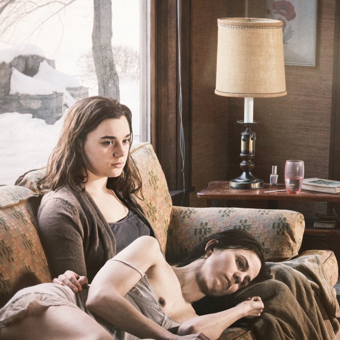
A photo taken with the iPhone 16 Pro Max using the No Fusion app with the Fuji Neutral Classic profile. The app disables Apple’s Deep Fusion processing, resulting in a more “authentic”, i.e., snapshot-like, and less overprocessed look.
Background
I have been unhappy with Apple’s default Camera app for years, especially with the recent iOS versions and the current iPhone line. Apple’s efforts to achieve “the best possible image” through multi-frame computational photography often lead to technically sharp and well-lit results, but the images feel lifeless. They look overprocessed, flat, and strangely artificial.
Apple uses several layered technologies here. Smart HDR, Deep Fusion, Photonic Engine, and various noise and tone-mapping steps pull information from multiple frames at different exposures, merge them, denoise them, and then optimize contrast and color locally. In theory this should create ideal photos under all conditions. In practice it often produces sterile images without depth. Everything is evenly lit, everything is clean, everything is clinically sharp, but nothing feels alive.
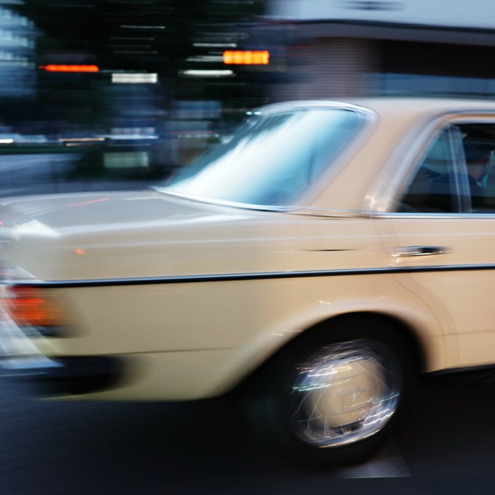
 A photo taken with the iPhone 16 Pro Max using the default Camera app. Note the flat lighting, lack of depth, and overprocessed appearance.
What I personally miss is the imperfect character that makes a photo an actual memory: natural shadows, depth, contrast, a bit of grit, small irregularities. These are the qualities that give an image mood rather than technical perfection. The default camera removes most of this in its attempt to “fix” everything.
Another major problem is reproducibility. The default app does not give you consistent resultsꜛ. Two photos taken at the same place and time can look dramatically different. I do not think this is a white balance issue. In my view it is the stack of computational steps that Apple recalculates for every single frame. Same location, same subject, same light, and yet a slightly different angle or tiny change in luminance leads to a completely different processing outcome. This inconsistency is frustrating, especially if you want a predictable look.
Because of this, I always treated the iPhone camera as a second-class tool: something for quick snapshots, receipts, addresses, document scans, random moments. The images are fine, but nothing I would ever put on my Flickr streamꜛ or use in serious photography.
My actual favorite camera is the Fujifilm X100VI. I love this camera deeply. Thanks to Fujifilm’s film simulations and the custom “recipes” people have created, the X100VI produces images that are remarkably close to analog film. The image quality is outstanding, and most importantly, I can use the photos straight out of camera without editing. I never edit my photos beyond occasional cropping and slight exposure correction if absolutely necessary.
Because of the Fuji, my standards for what I consider a “good” photo have become extremely high. For me this means authenticity: an image that does not look processed, that feels candid, unstaged, with a light film-like nostalgia. Nostalgia not in the kitschy sense, but in the sense of producing something that looks like an actual memory. This is exactly what the X100VI gives me, which is why I value it so much.
However, I do not carry it with me twenty-four seven. There are always moments I wished I had captured, but could not, simply because the camera stayed at home.
So I tried many alternative iPhone camera apps in hope of getting closer to the aesthetic I want. I tried a lot. Much of it was garbage. At one point I even experimented with the Ricoh GR IIIx, because it is smaller than the X100VI, pocketable, and also supports film recipes. But those recipes did not convince me at all, so I sent the camera back.
Most recently I had settled on Pearlaꜛ, because it has a preset that roughly simulates Fujifilm’s Classic Negative. But even Pearla was inconsistent. Some shots were too dark, some looked over-styled, and the character of the processing often changed from image to image. I never understood why.
Then I came across a YouTube videoꜛ about an app called No Fusion.
No Fusionꜛ is a simple but brilliant idea: it disables Apple’s entire multi-frame Deep Fusion pipeline and gives you a clean, single-frame output with consistent color and contrast. You get a straightforward photo without the heavy computational steps that normally run in the background. The app offers custom “recipes” that mimic film-like looks, but they are not filters in the usual sense; they are subtle, stable, and reproducible profiles.
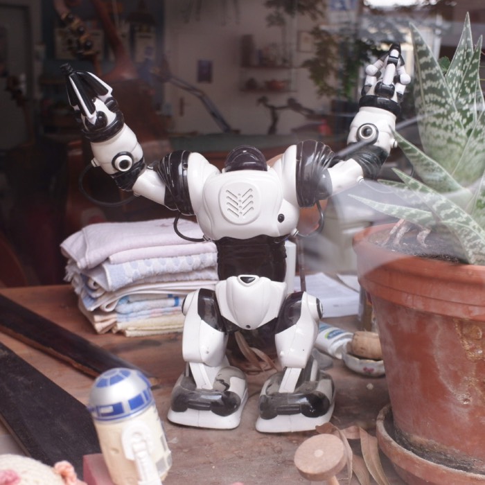
 The same motive as above, here taken with the iPhone 16 Pro Max using the No Fusion app with the Fuji Classic Negative profile. The app disables Apple’s Deep Fusion processing, resulting in a more “authentic” and overprocessed look. The image has good depth and contrast, resembling the look of a Fujifilm camera.
In practice, the app has been excellent so far. It produces
a) reliable and consistent images,
b) photographs that do not look overprocessed,
c) good results in every lighting situation I have tested, and
d) the most convincing camera profiles I have seen on iPhone.
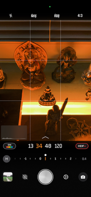
The No Fusion app interface on iOS.
My personal favorite is Fuji Neutral Classic, which comes closest to Classic Neg on my Fujifilm X100VI. And compared to the X100VI, No Fusion gets surprisingly close. For this post I shot a set of comparison photos: the default iOS camera, No Fusion, and the X100VI side by side. I will show these below.
 Again, the same motiv, taken with my Fujifilm X100VI using the Classic Negative film simulation. The image has good depth, contrast, and a nostalgic film-like quality that I highly value.
Comparison: iOS default vs. No Fusion vs. Fujifilm X100VI
Here are sets of comparison photos taken with the iPhone 16 Pro Max using the default Camera app (left), the No Fusion app (with Fuji Neutral Classic profile, center), and my Fujifilm X100VI (using Classic Negative film simulation, right). I had one day off this week and went for a walk in the late afternoon light to capture these images.
All images are straight out of camera with no post-processing beyond cropping some of them for better comparison. All photos were taken with the same focal length (1.5/35mm for the iPhone and 2/35mm for the Fuji) and at same framing with just a few seconds difference. I forgot to set the aspect ratio on the iPhone to 3:2, which would have been identical to the Fuji. Instead, the iPhone shots are in 4:3, however, I did not crop them to match exactly, to keep the comparison fair.
Please, judge for yourself. You can click on each image to see the full-resolution version. I’m unsure whether flickr, where all these images are hosted, does apply additional compression. If so, I hope it is minimal enough so that the differences remain visible.


In my opinion, the No Fusion image (center) is much closer to the Fuji (right) than the default iOS camera (left). The iOS photo looks overprocessed, flat, and lifeless. The No Fusion image has more depth, natural contrast, and a film-like character that I find much more appealing.
Comparison: iOS default vs. No Fusion
After having that day off, I continued to test No Fusion over the next days, comparing its results with those of the default iOS Camera app. In most situations, I found that No Fusion produced images that were more pleasing and more “authentic”-looking than the default app.
iOS default app photos are on the left, No Fusion photos on the right:


Conclusion
With No Fusion, the iPhone 16 Pro Max finally produces images that feel like actual photographs rather than processed composites. For the first time in years, I feel that I can use the iPhone not only for documentation but for genuine memory-making. It is still not my X100VI, of course, but it is close enough that I no longer regret leaving the Fuji at home.
I am not affiliated with the developers of No Fusion, nor is this post sponsored in any way. I am simply glad I finally found an app that solves the problems I have had with the default iPhone camera for years. I even replaced the stock Camera app in my dock with it.
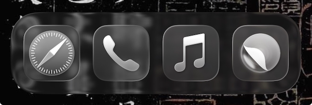 The dock on my iPhone, where I have replaced the default Camera app with No Fusion (right) for quick access.
Please note, that the No Fusion app is a paid app (one-time purchase of €24.99 or subscription of $9.99 per year as of November 2025). However, the app offers a one-week free trial, so you can test it before committing to a purchase.

comments